Hazira Khata is a digital attendance and classroom management app built for Bangladeshi teachers and schools. It handles daily attendance, exam results, fee collection, parent communication, and document generation — used by 100,000+ teachers across Bangladesh.
The problem
The original app was built with legacy Android XML layouts, resulting in a cluttered, inconsistent UI that frustrated users. Blue-heavy color scheme, dense text, small touch targets, and no visual hierarchy made the app feel outdated compared to modern alternatives. With 100K+ users depending on it daily, a careful redesign was critical — it had to modernize without breaking existing workflows.
What we did
Sazzad executed a full UI/UX overhaul: migrated key screens from XML to Jetpack Compose, replaced the heavy blue theme with a clean white/neutral design system, introduced icon-based navigation grids instead of text-heavy button lists, redesigned data-dense screens (attendance, student lists, fee tracking) with proper spacing and hierarchy, and modernized form inputs with Material 3 components. The redesign covered 38+ screens while preserving all existing functionality.
Before & after — drag to compare
Drag the slider on each screen to see the transformation. Every screen was redesigned from legacy XML to modern Jetpack Compose with Material 3.
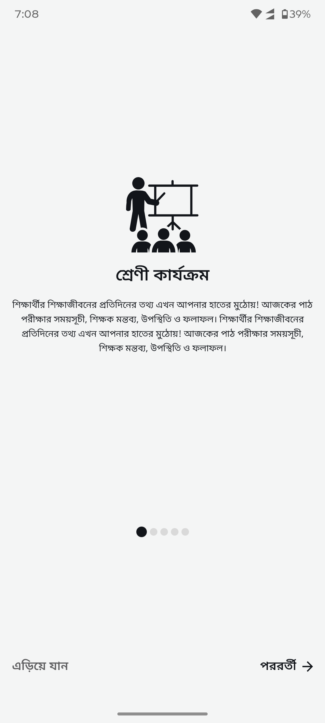
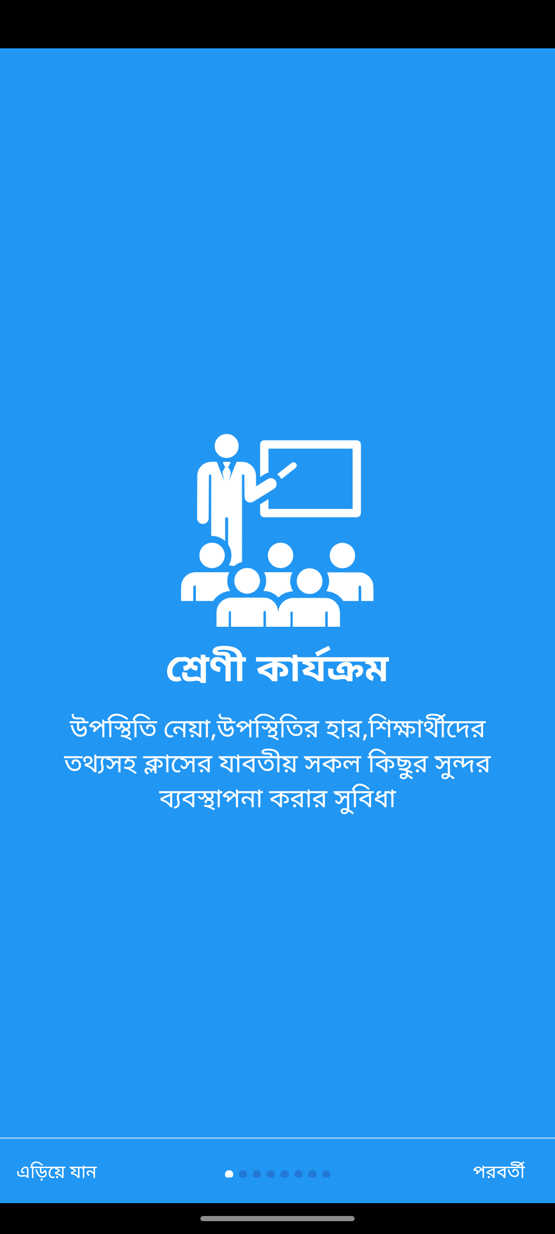
Onboarding splashBlue splash with dense text replaced by clean white onboarding with readable typography and pagination dots.
After
Before
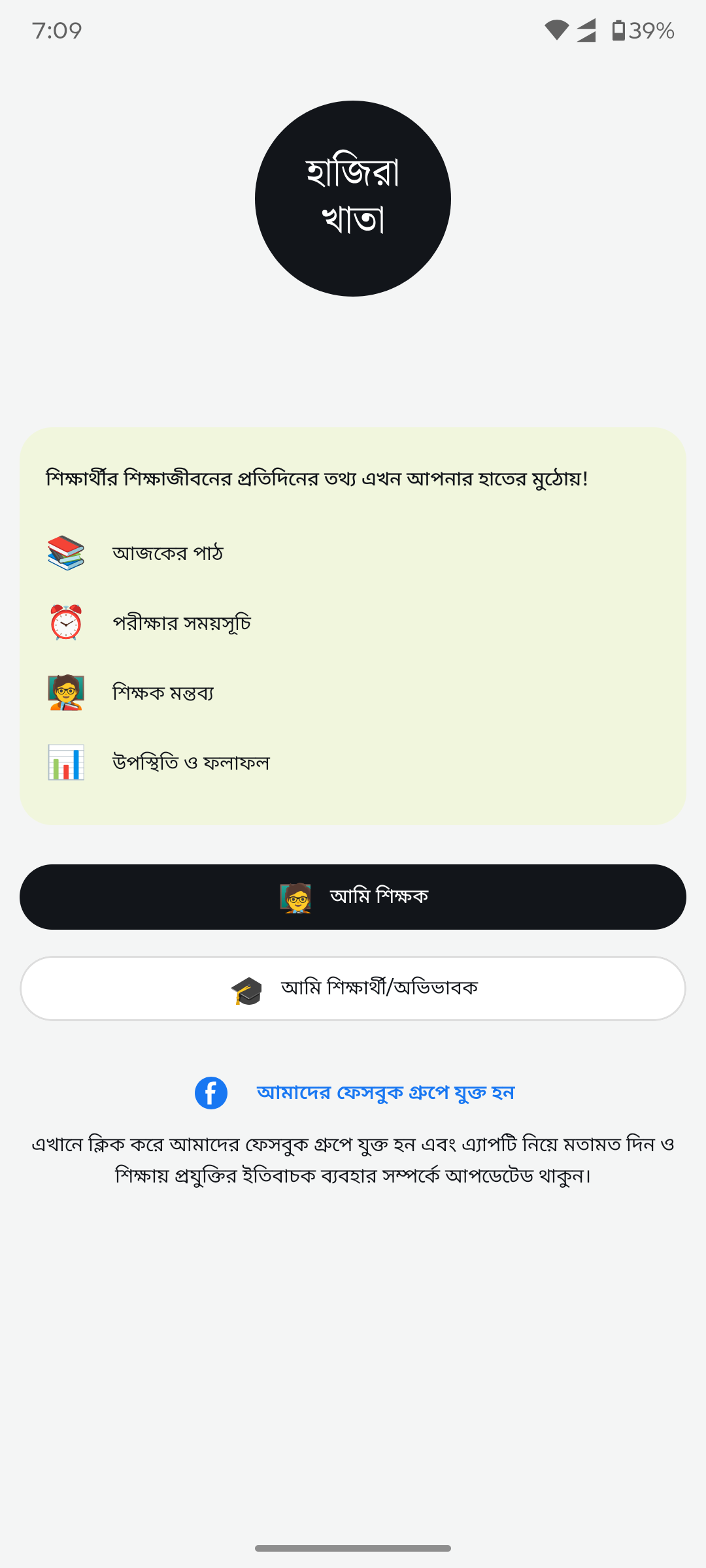
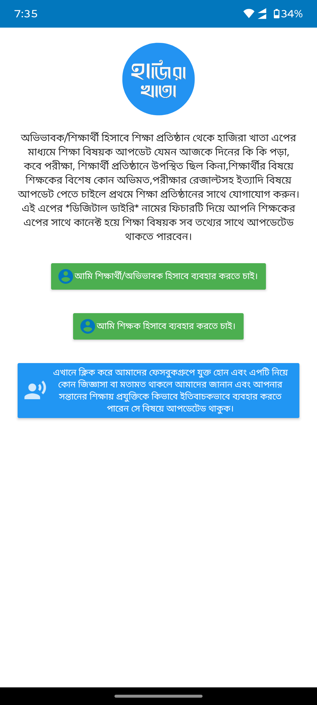
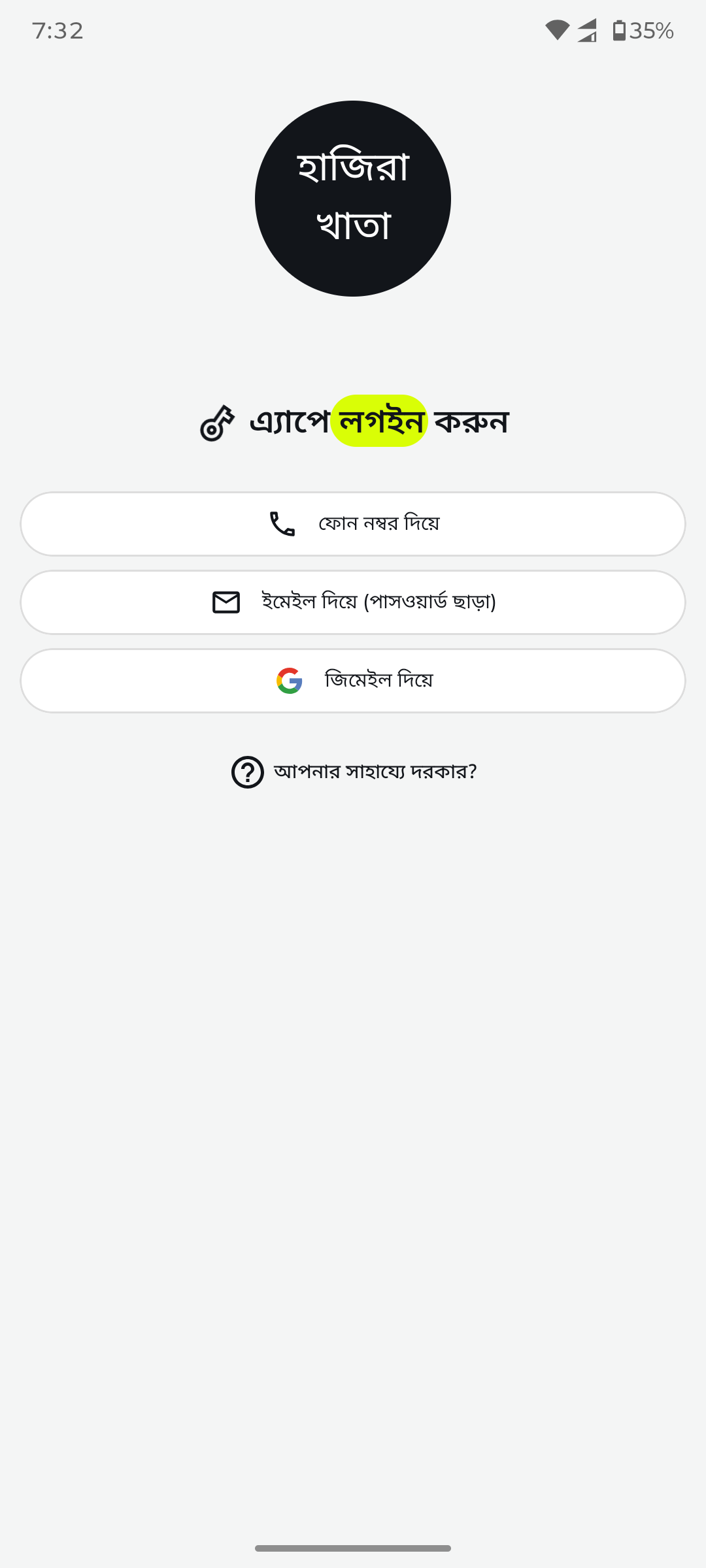
Login & role selectionWall of text with green buttons replaced by structured cards, clear feature list with icons, and prominent role selection buttons.
After
Before
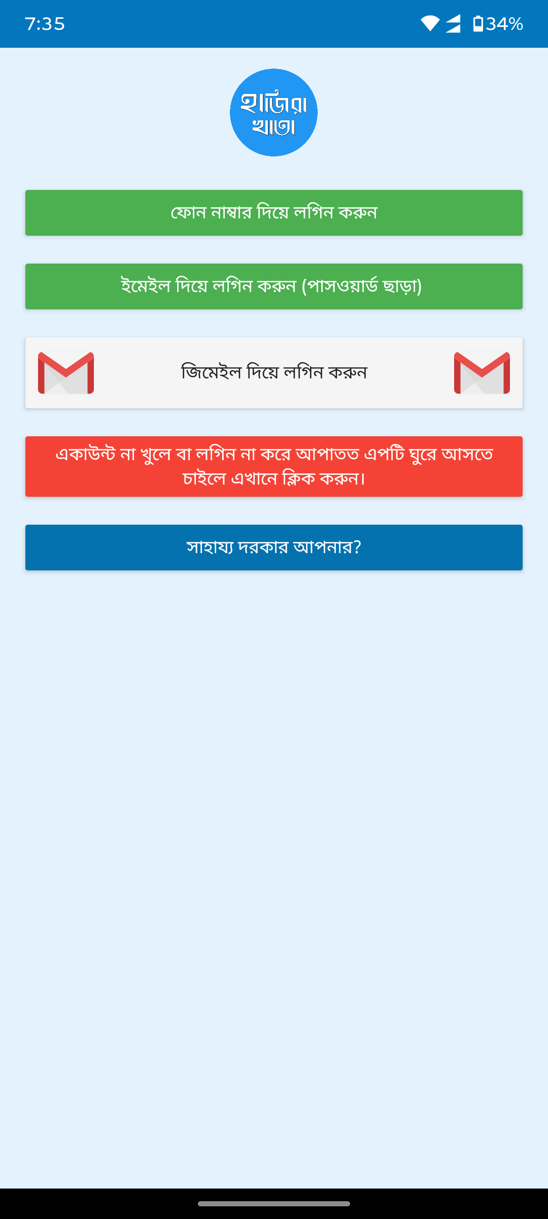
AuthenticationBasic login form replaced by clean branded login screen with phone, email, and Google sign-in options.
After
Before
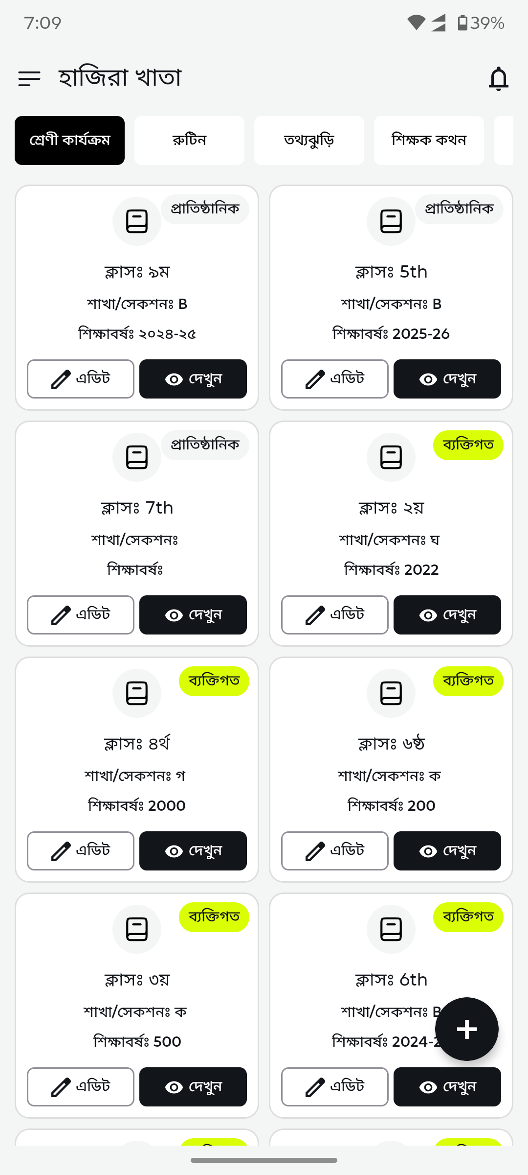
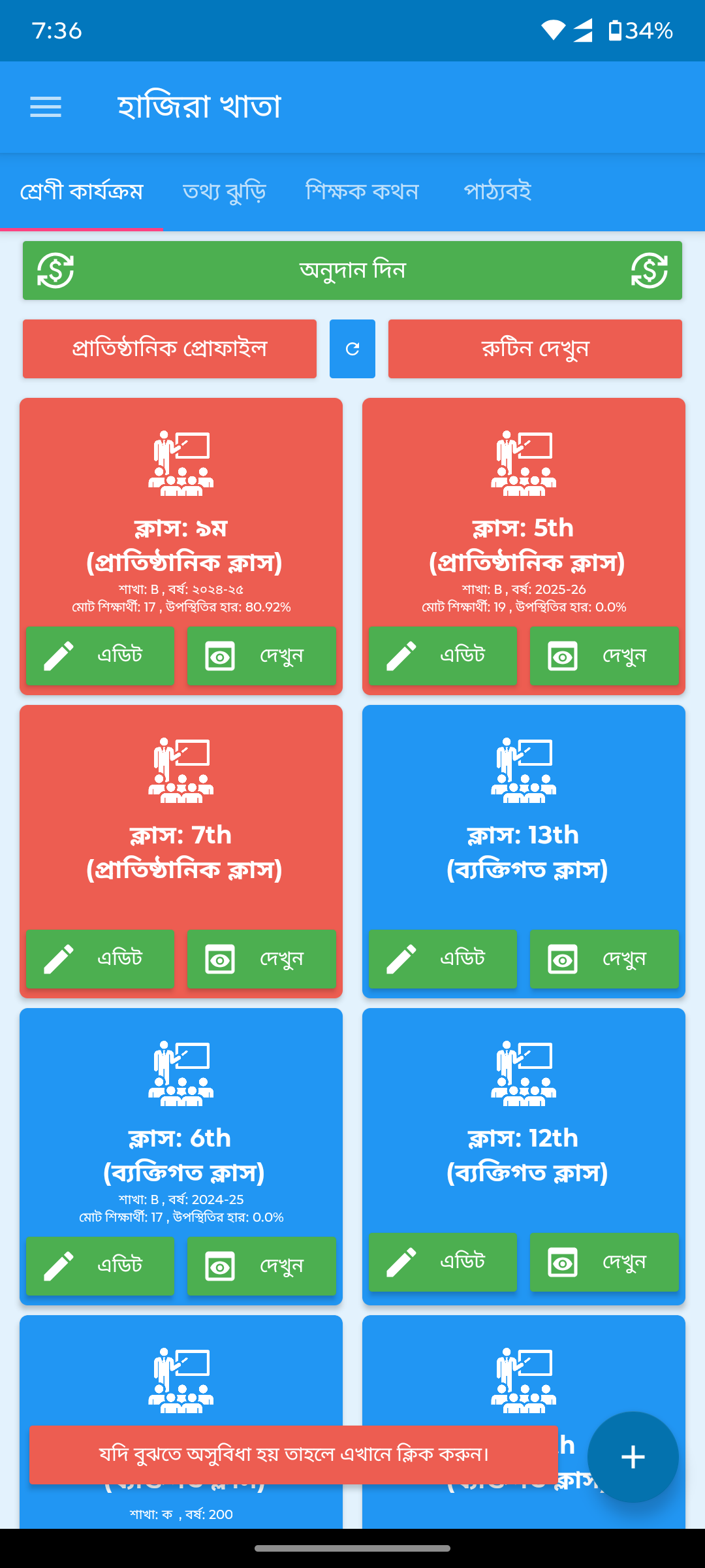
Class dashboardBlue cards with tiny text and scattered icons replaced by clean white grid with status badges and organized metadata.
After
Before
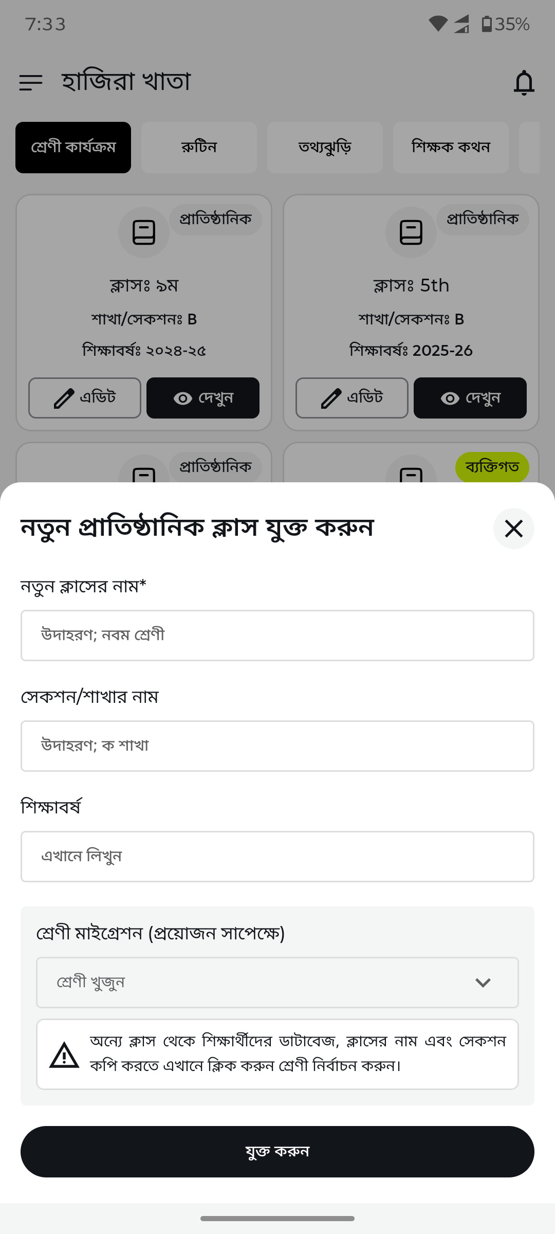
Add new class (bottom sheet)Basic dialog replaced by a clean bottom sheet form with structured input fields and validation.
After
Before
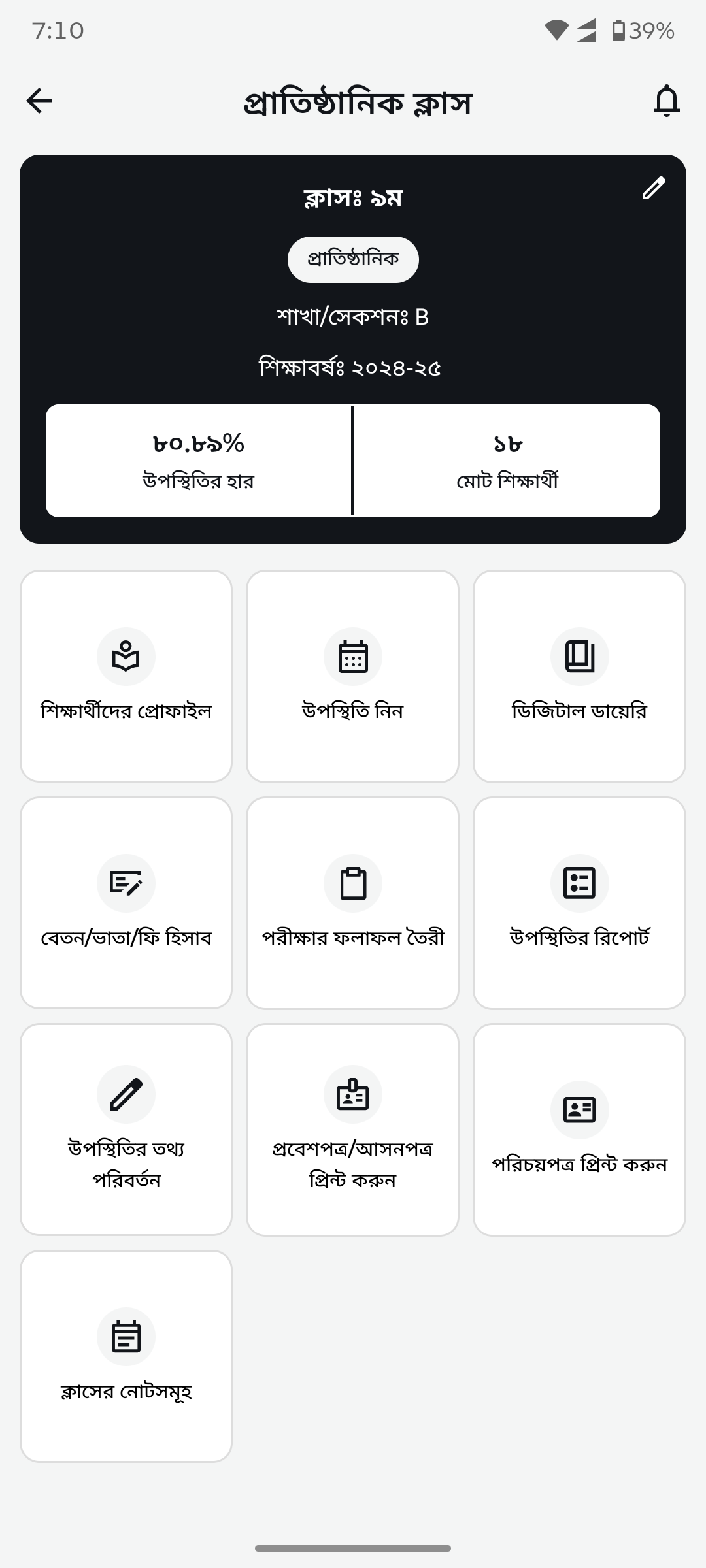
Class detail panelCramped button list with banners replaced by icon-based navigation grid with attendance stats and proper spacing.
After
Before
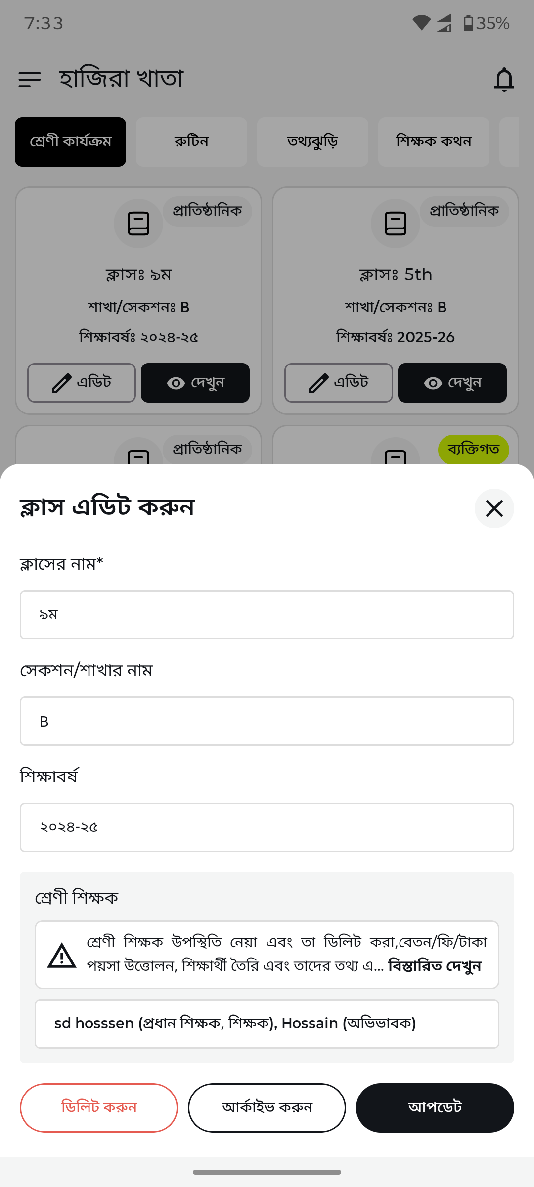
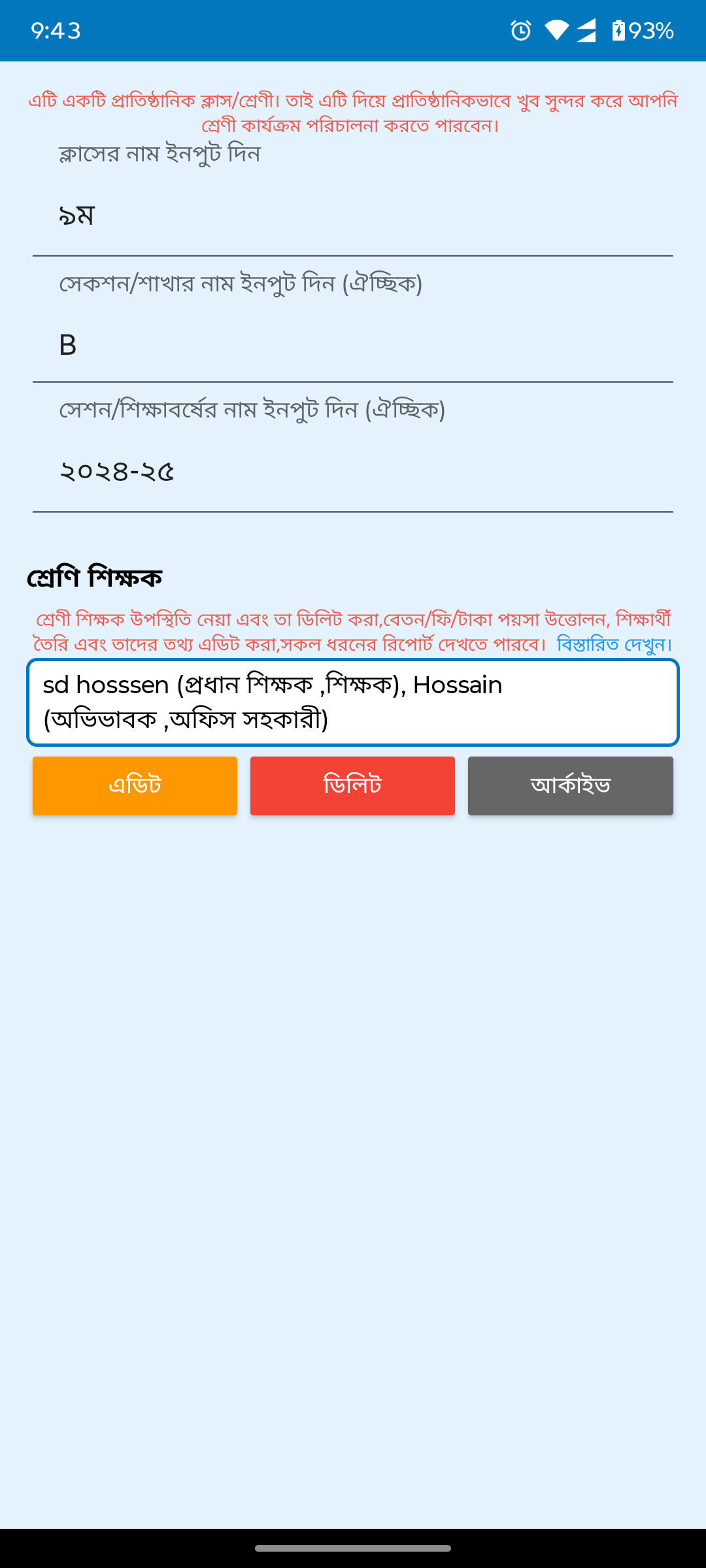
Edit class (bottom sheet)Basic edit dialog replaced by structured bottom sheet with teacher assignment and section management.
After
Before
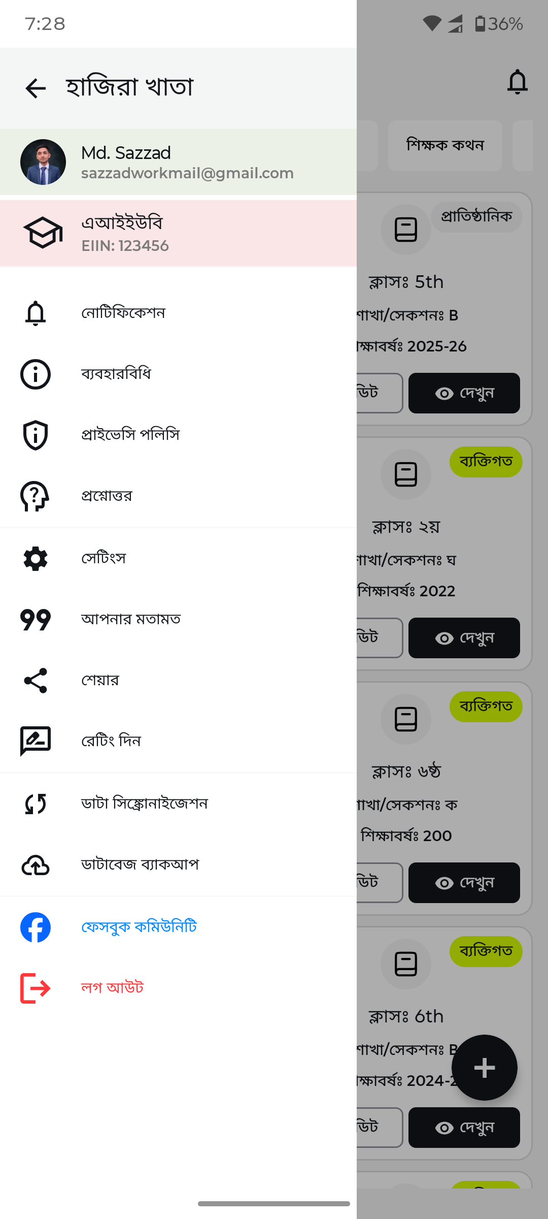
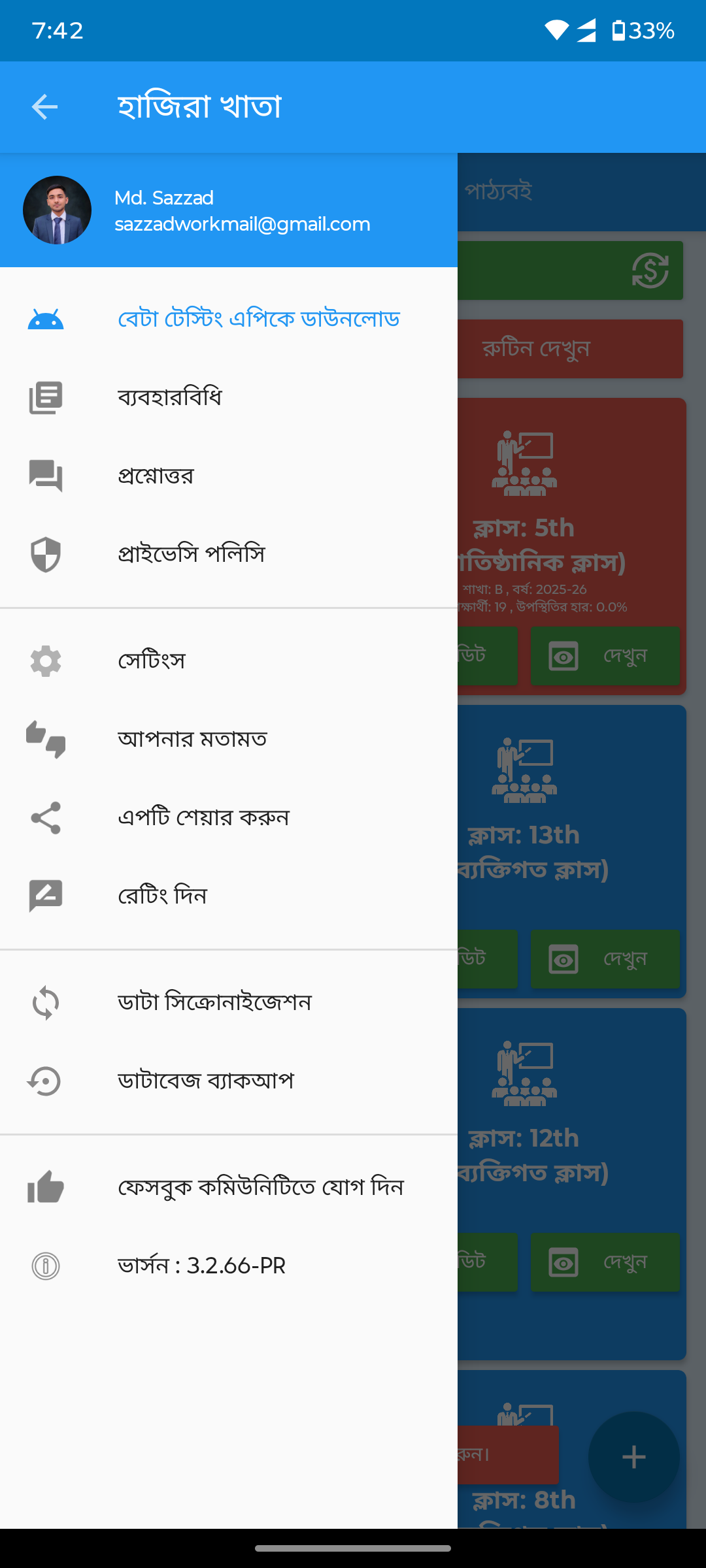
Navigation drawerBasic navigation list replaced by modern drawer with user profile card, organized menu sections, and social links.
After
Before
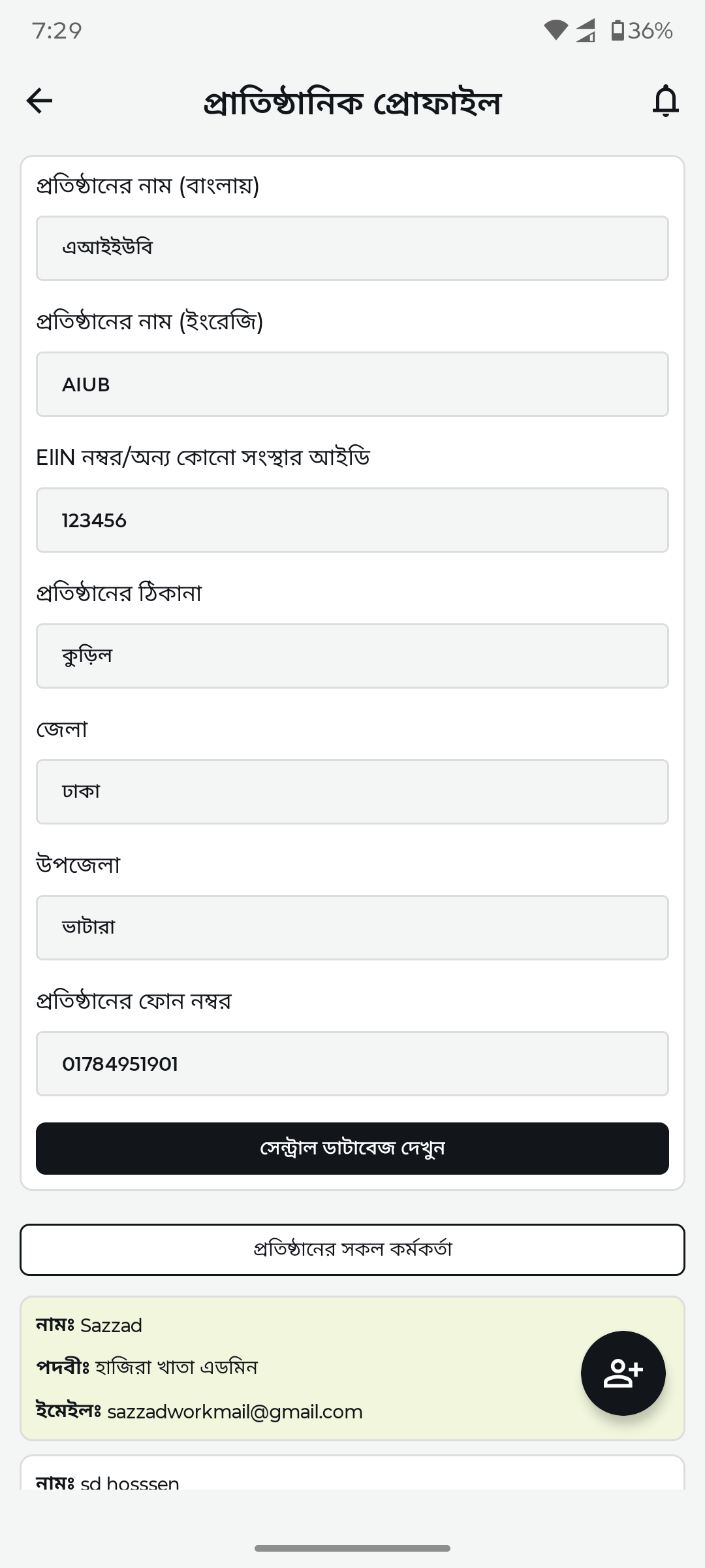
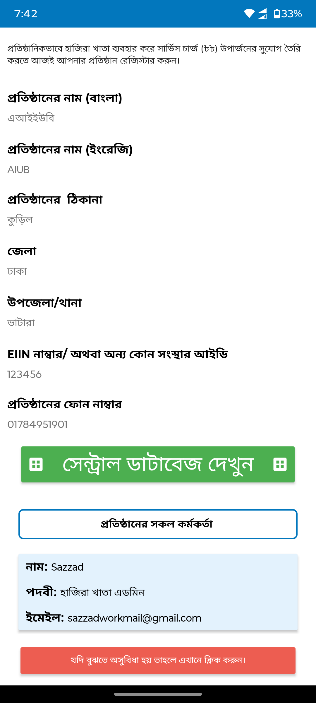
Institution profileBasic form replaced by structured profile page with institution details, EIIN, location hierarchy, and admin list.
After
Before
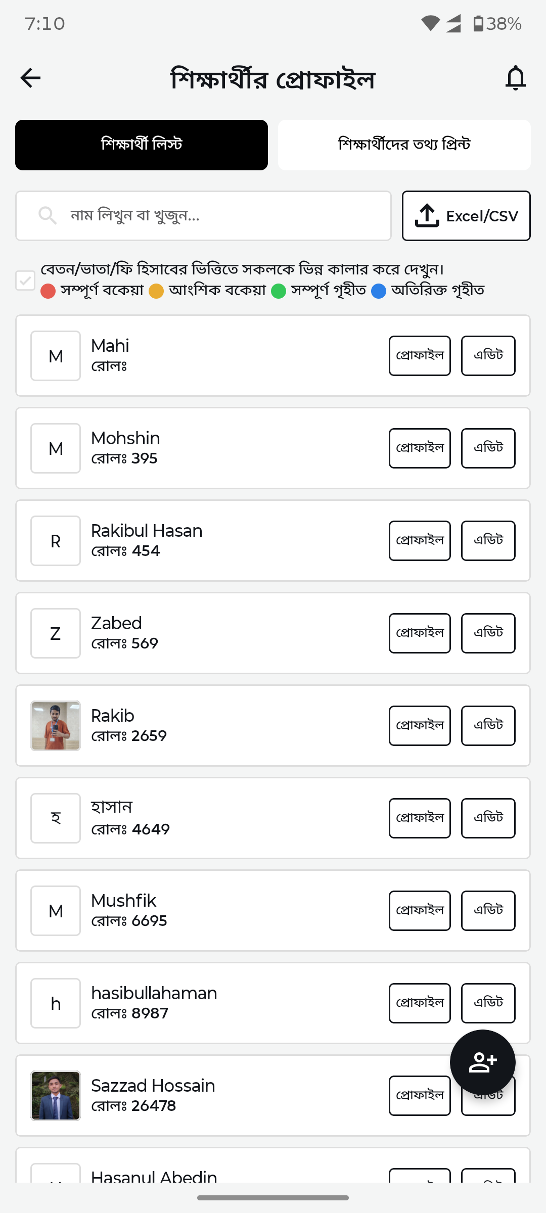
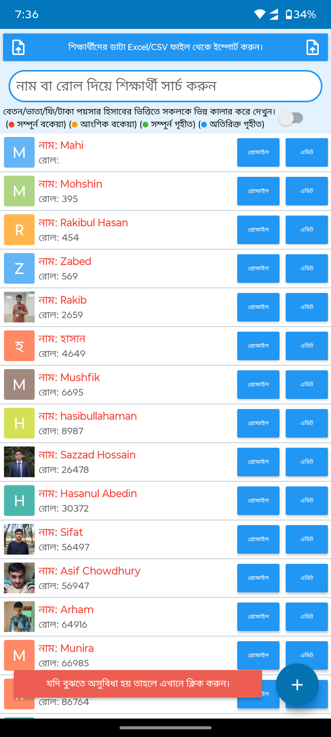
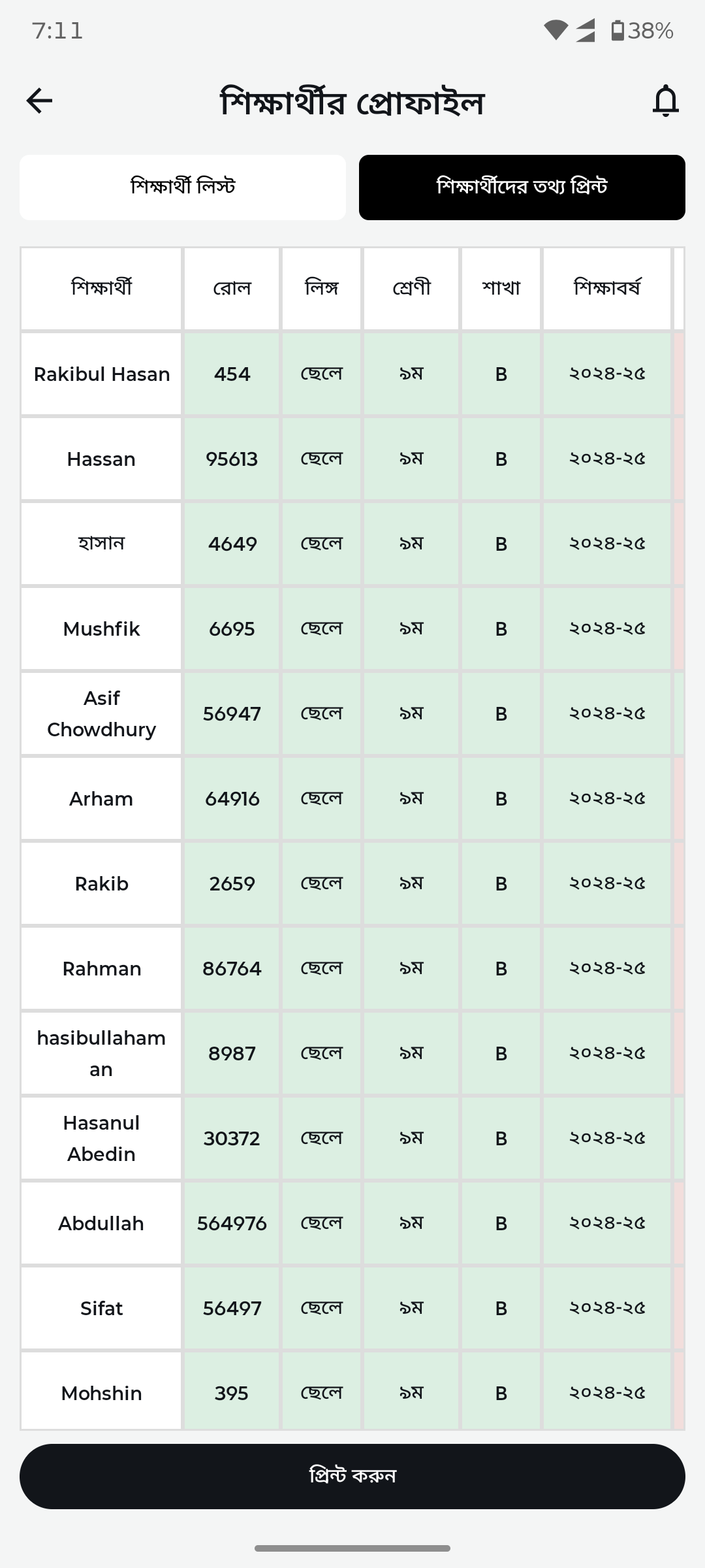
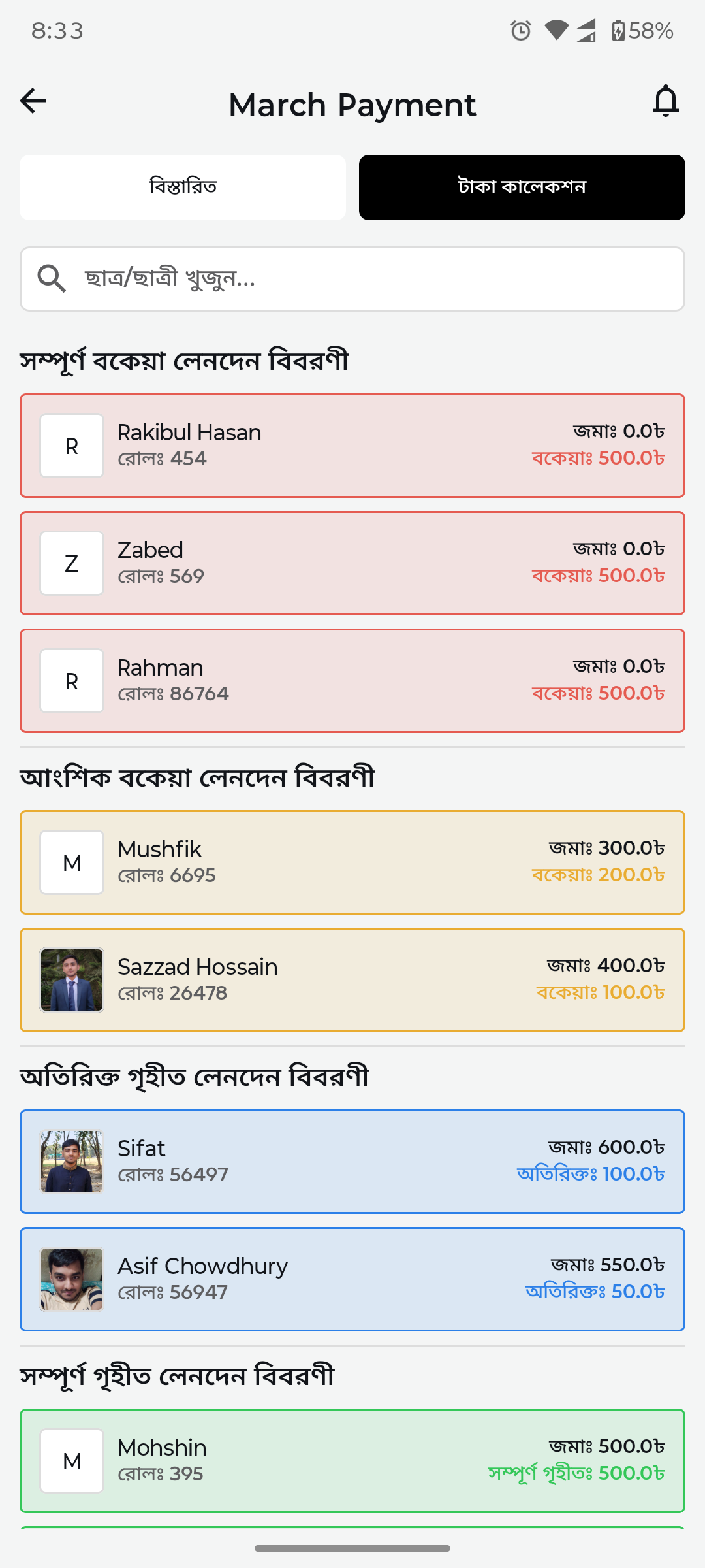
Student listDense blue student cards with cluttered badges replaced by clean list with avatar initials, search bar, and CSV export.
After
Before
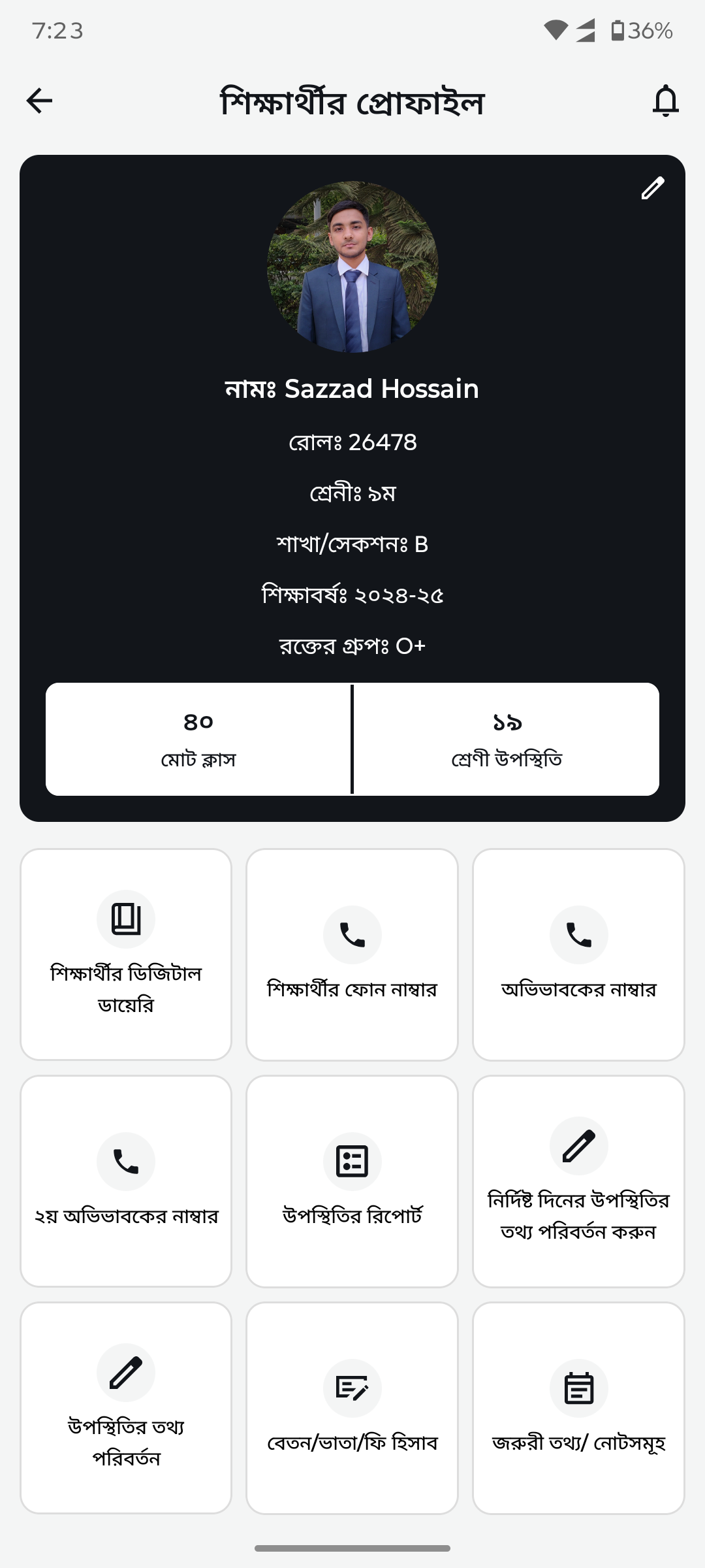
Student profile detailBasic text fields replaced by hero card with photo, stats (total classes, attendance), and icon-based action grid.
After
Before
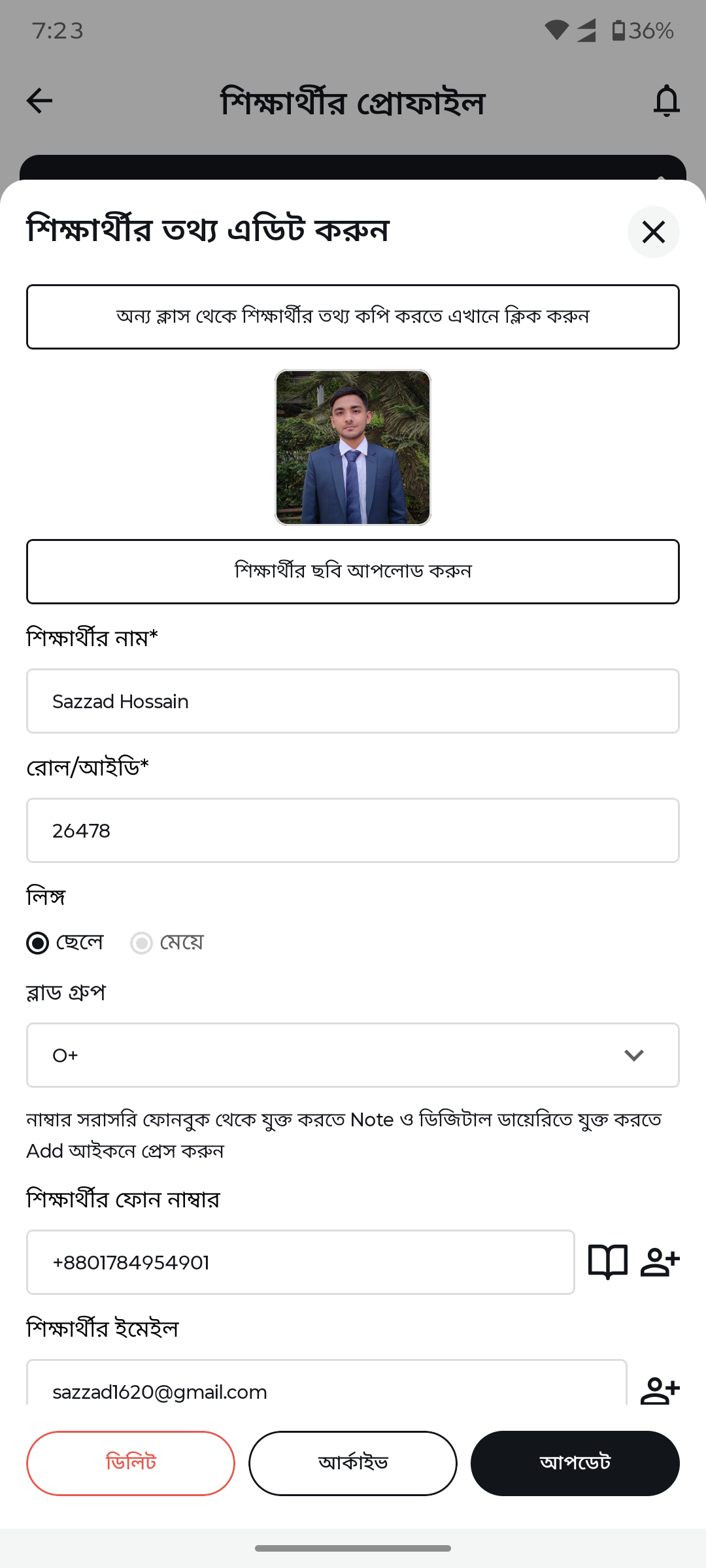
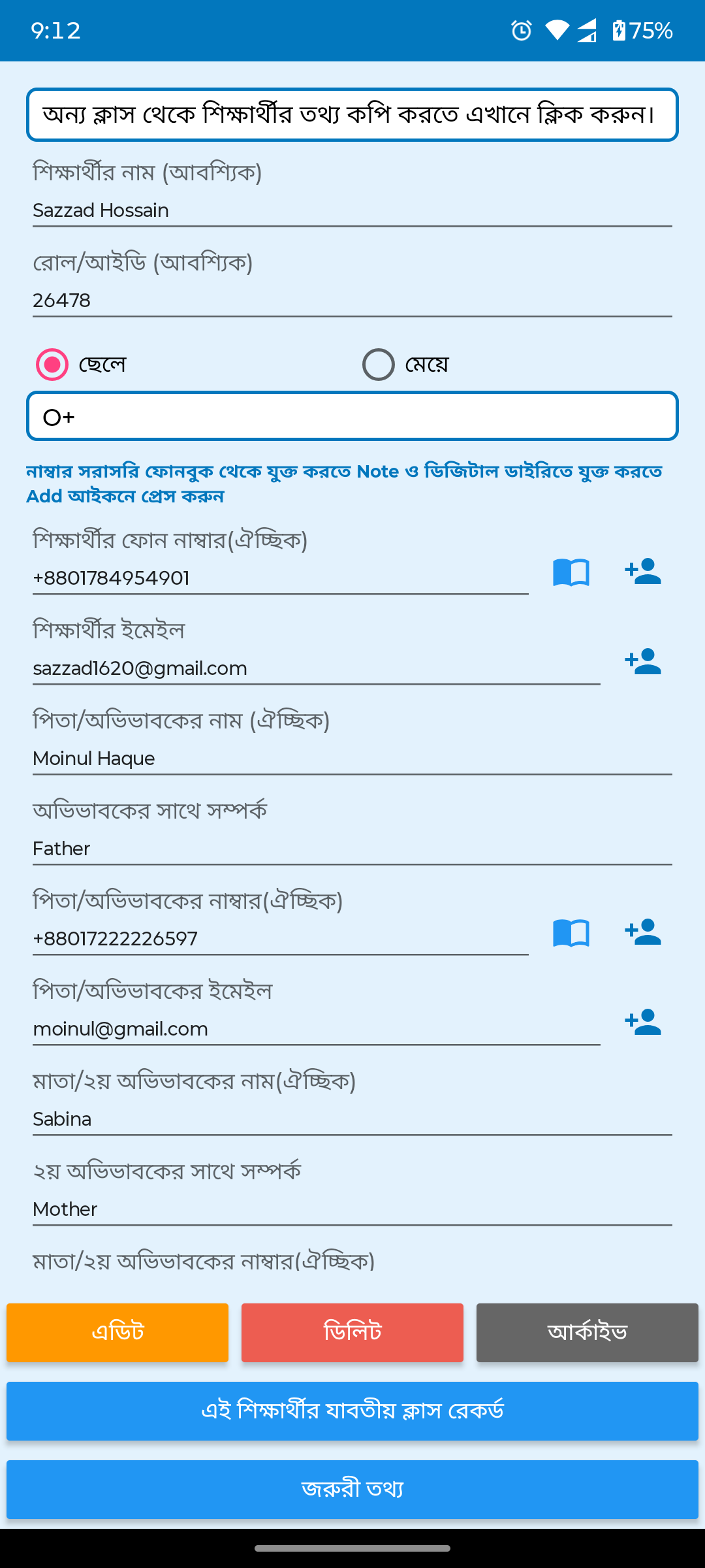
Edit student profileCluttered form replaced by clean edit form with photo upload, gender selection, blood group dropdown, and contact fields.
After
Before
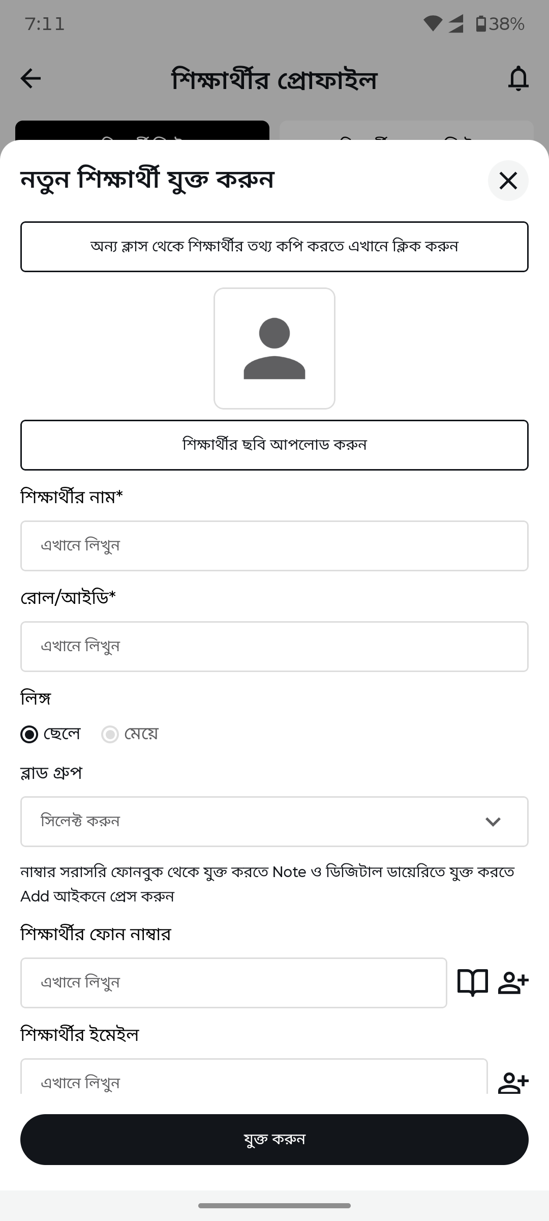
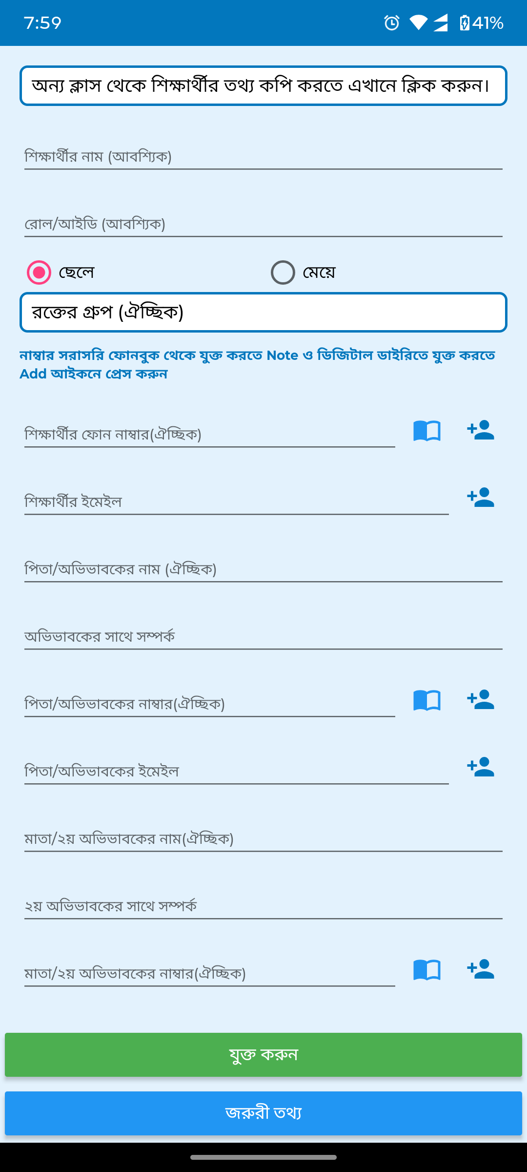
Add new studentCramped form with tiny fields replaced by spacious form with photo upload, structured inputs, and clear action button.
After
Before
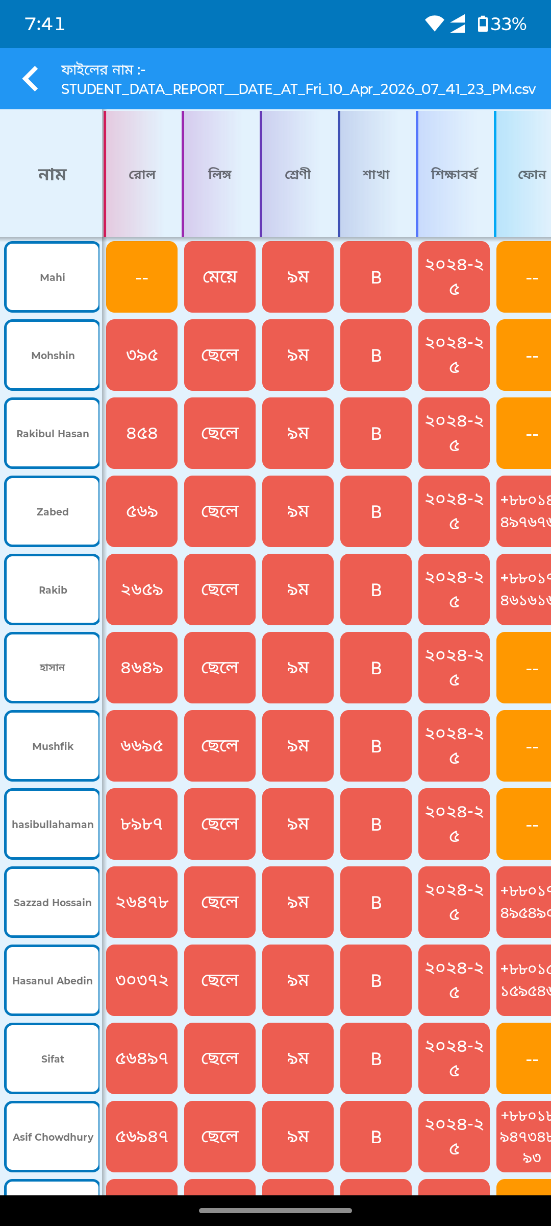
Student data tableBasic table with no styling replaced by clean tabular view with proper column headers, zebra striping, and print button.
After
Before
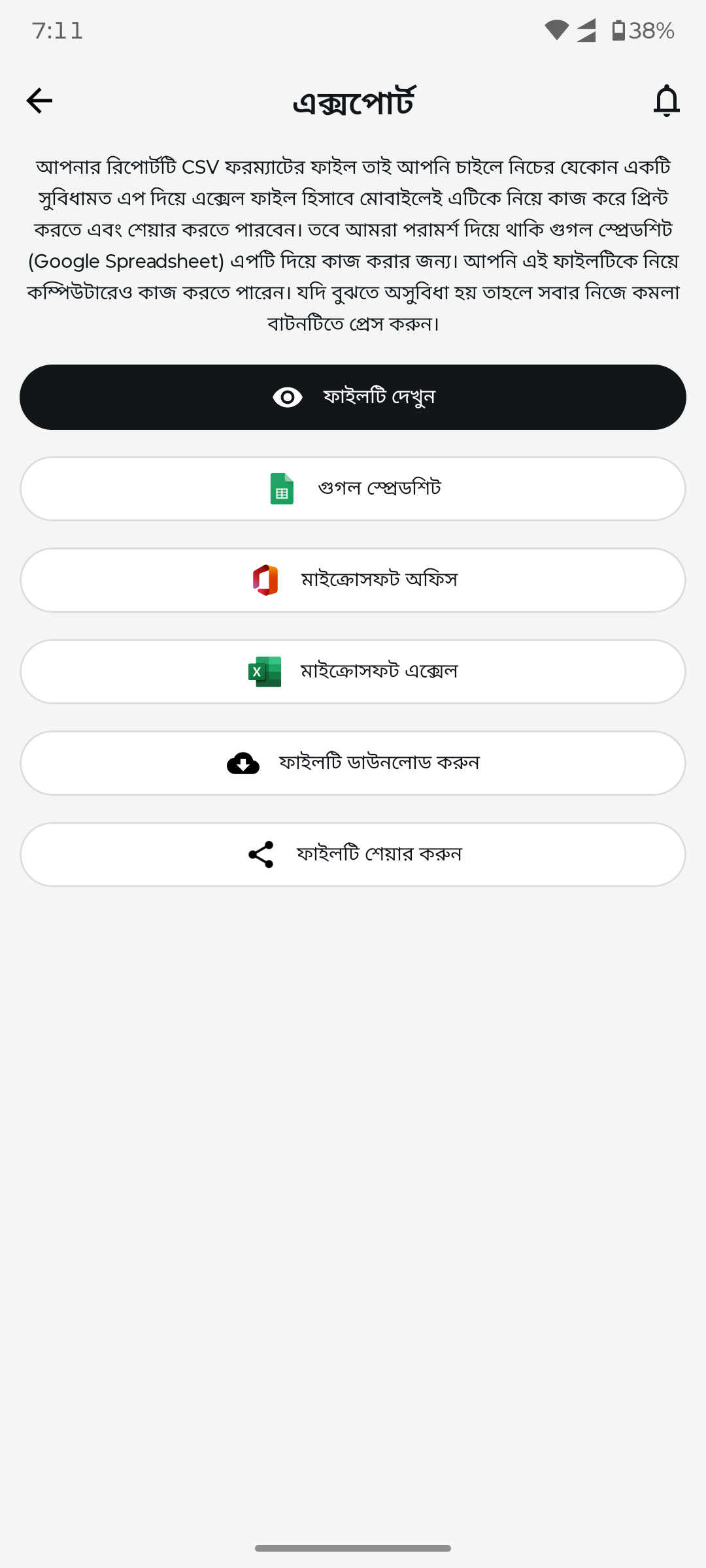
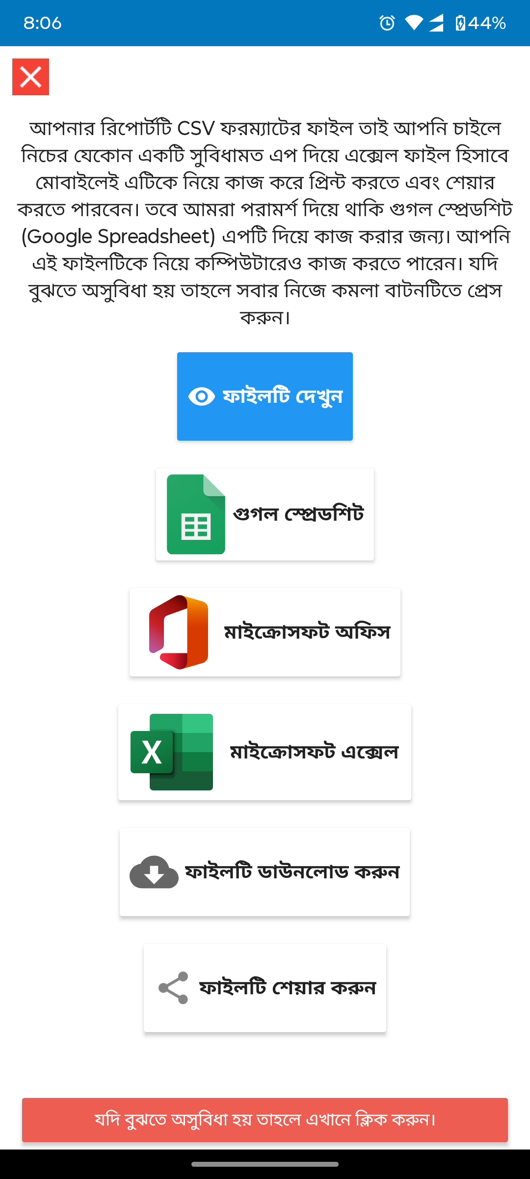
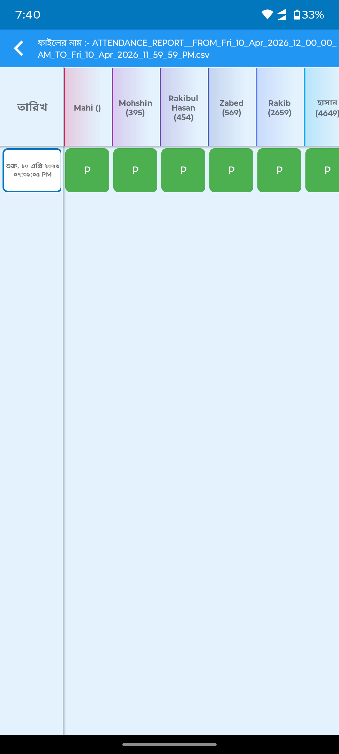
Export optionsNo export UI replaced by clean export screen with file format options (CSV, Excel, Sheets) and share functionality.
After
Before
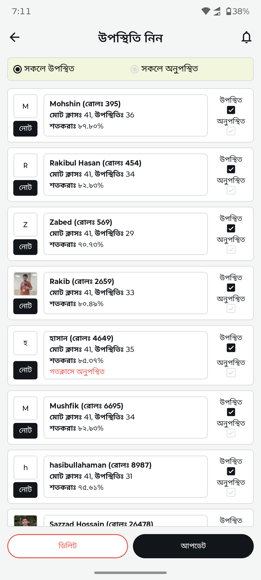
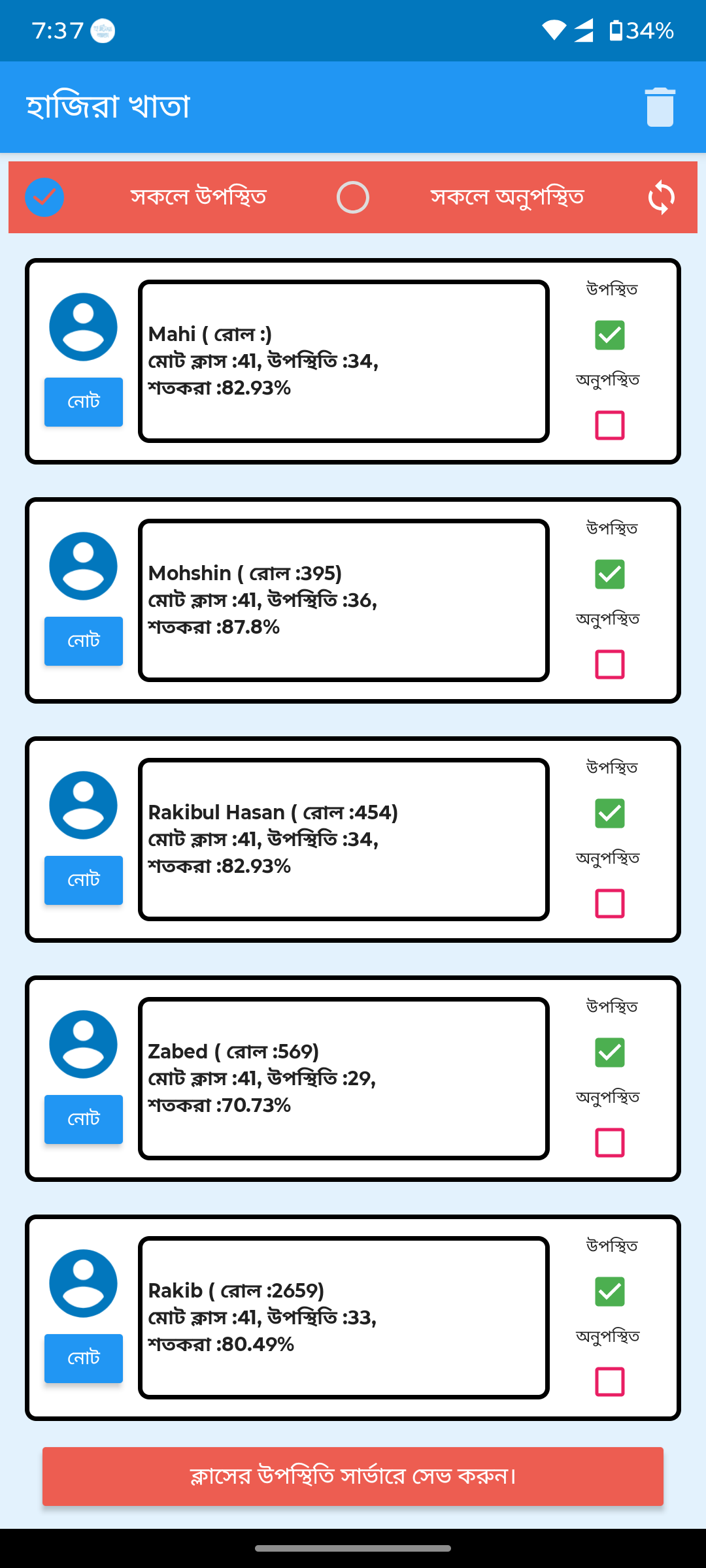
Attendance markingBlue cards with checkboxes replaced by minimal list with present/late toggles, profile photos, and bottom action bar.
After
Before
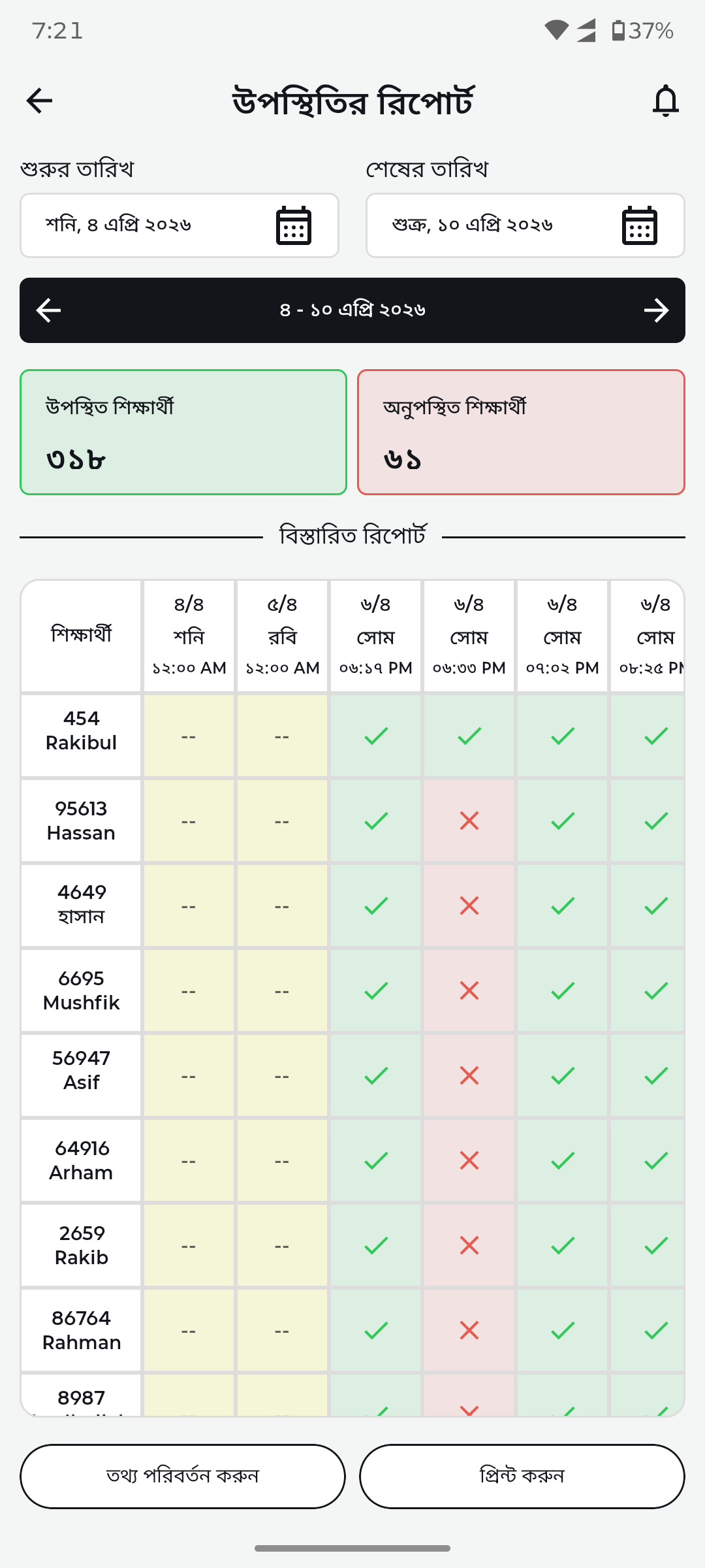
Attendance report gridBasic table replaced by color-coded attendance grid with date range picker, present/absent counts, and status icons.
After
Before
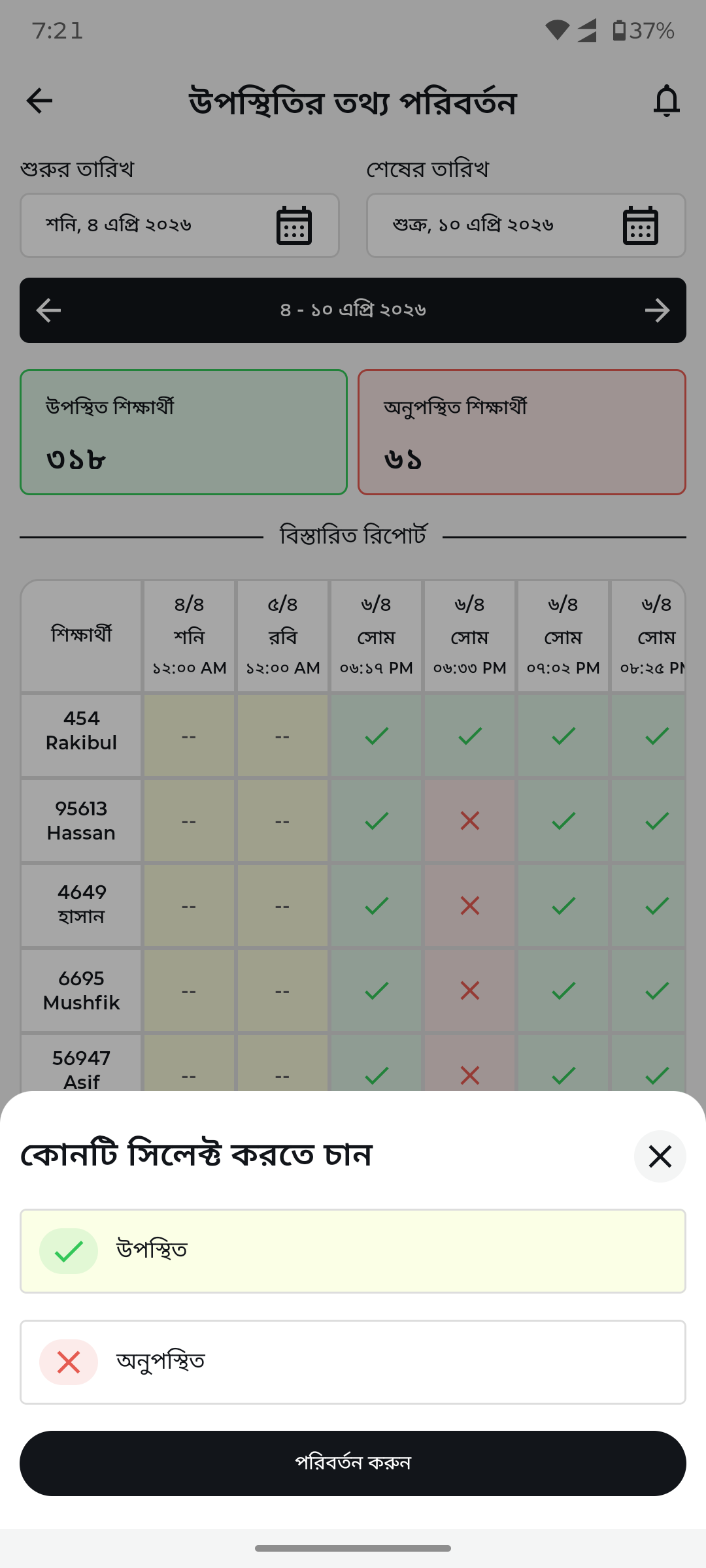
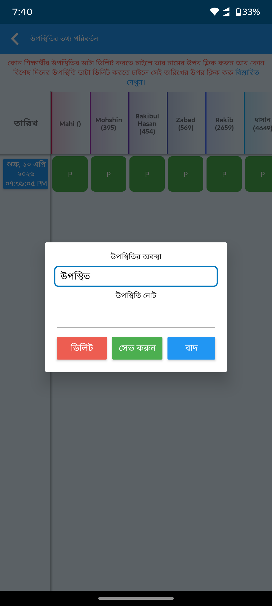
Edit attendance recordNo edit UI replaced by bottom sheet with present/absent toggle for correcting attendance records.
After
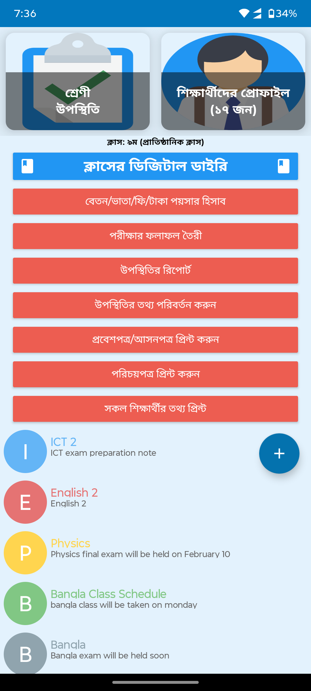
Before
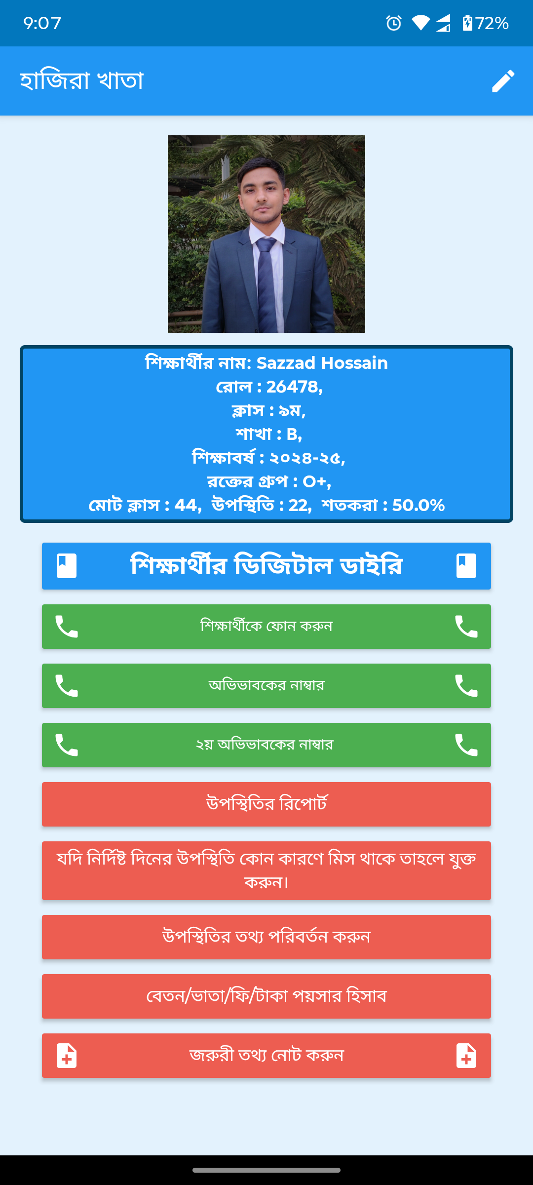
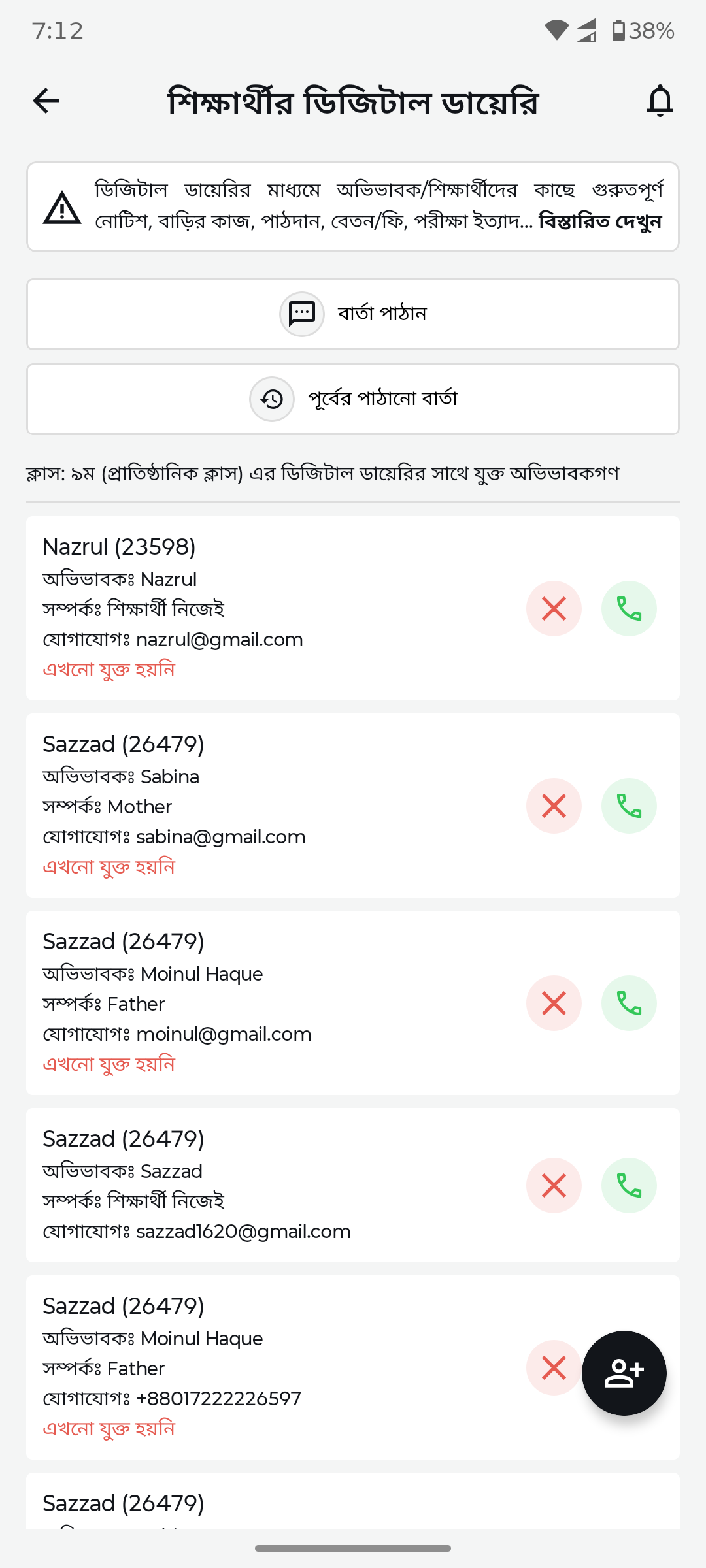
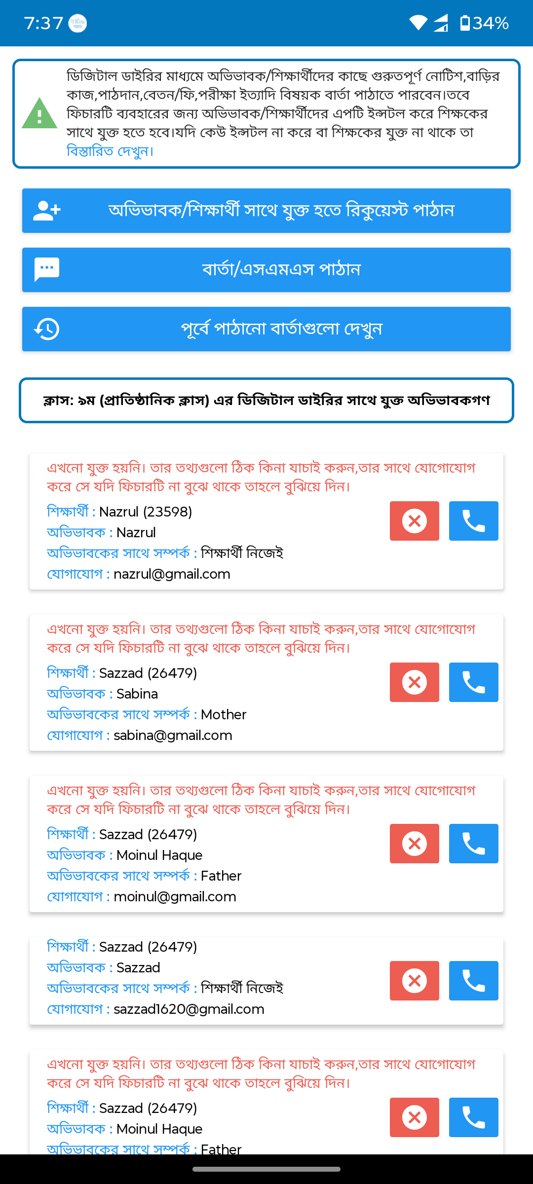
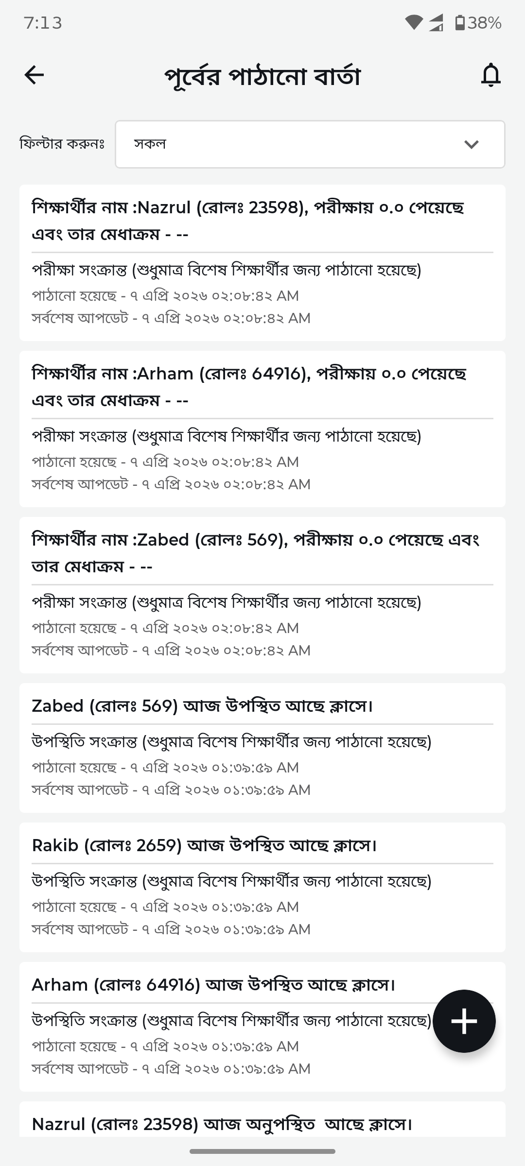
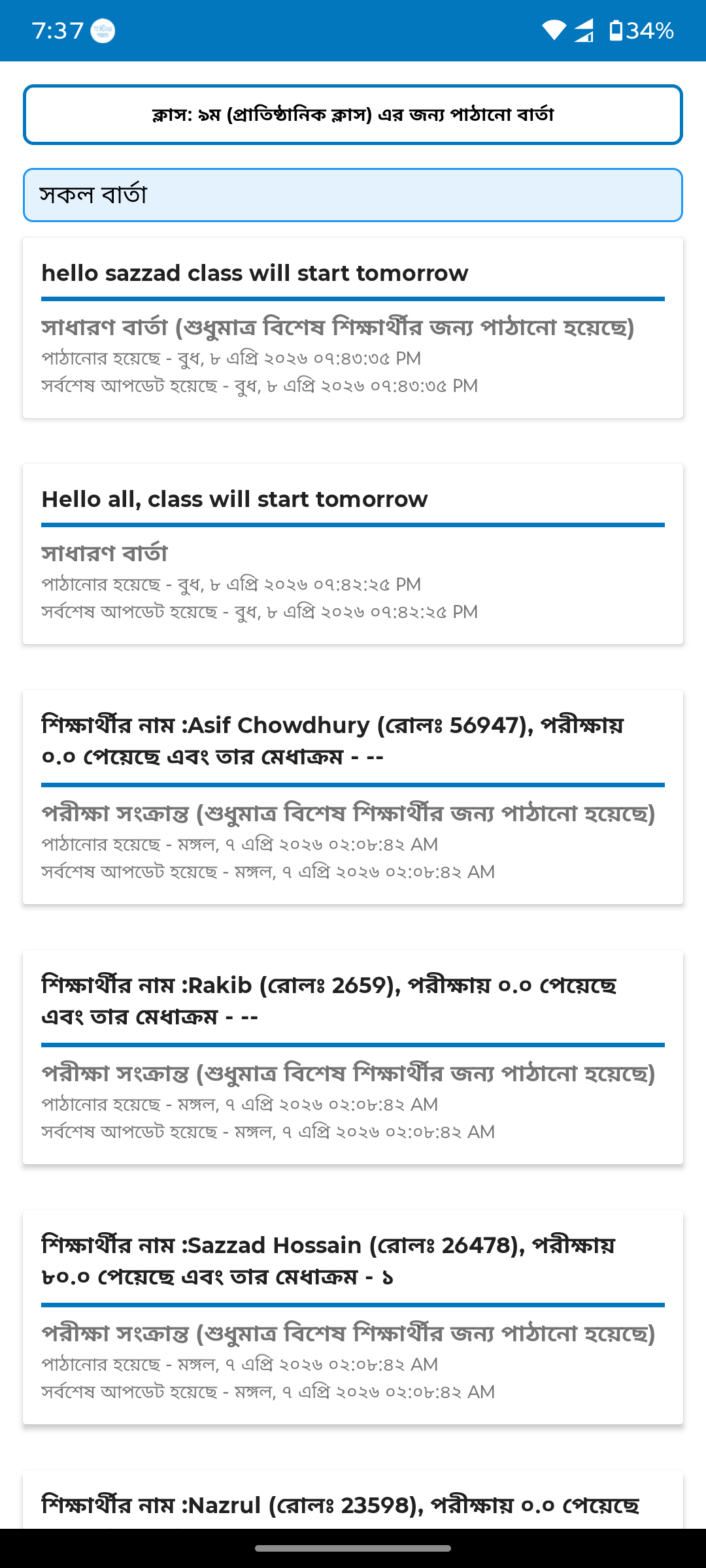
Digital diary (messages)Dense message list replaced by clean card layout with student info, relationship tags, and invite status indicators.
After
Before
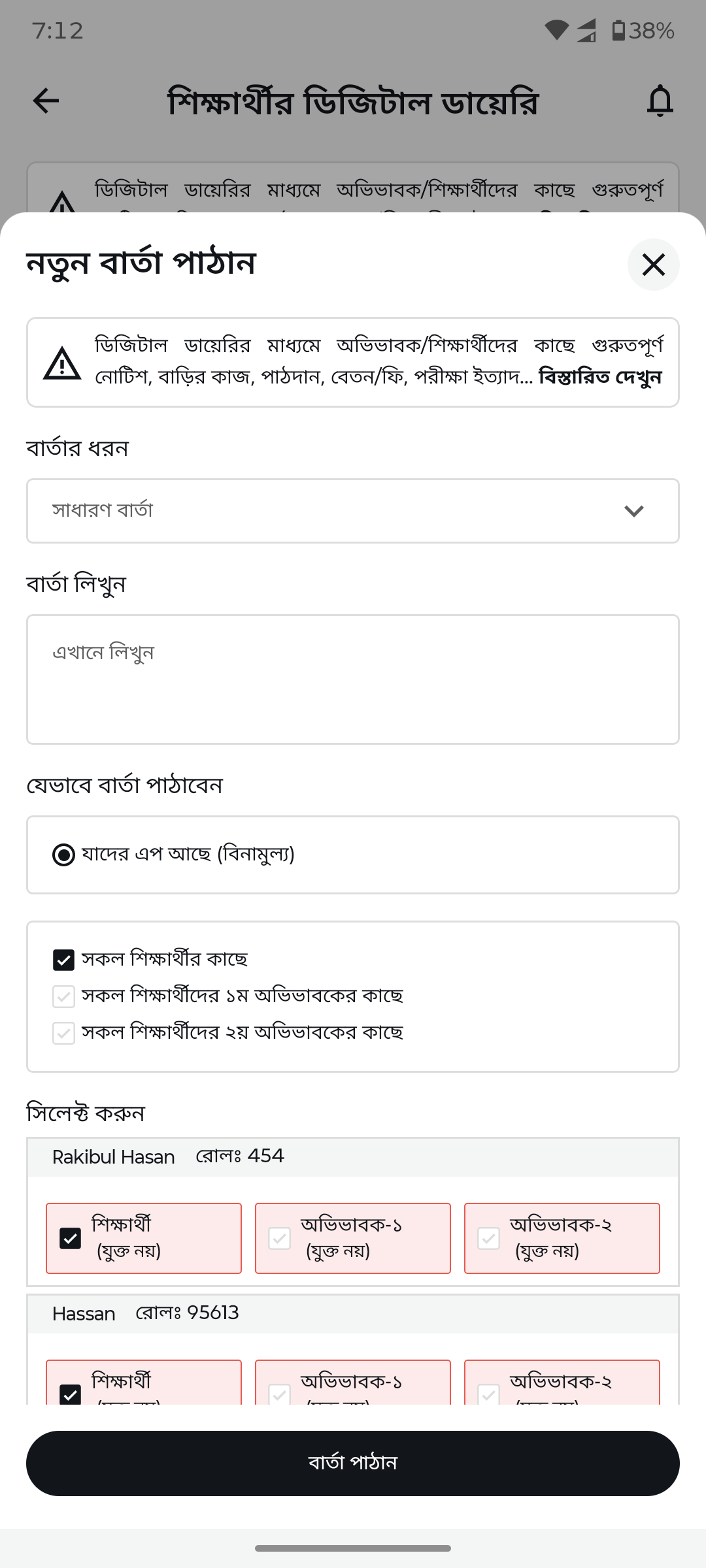
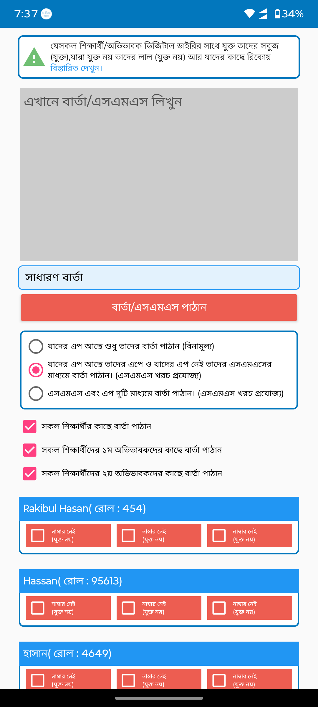
Compose new messageBasic text area replaced by structured form with message type selector, recipient filters, and student preview cards.
After
Before
Sent messages historyPlain text list replaced by organized message thread with timestamps, type badges, and clear message hierarchy.
After
Before
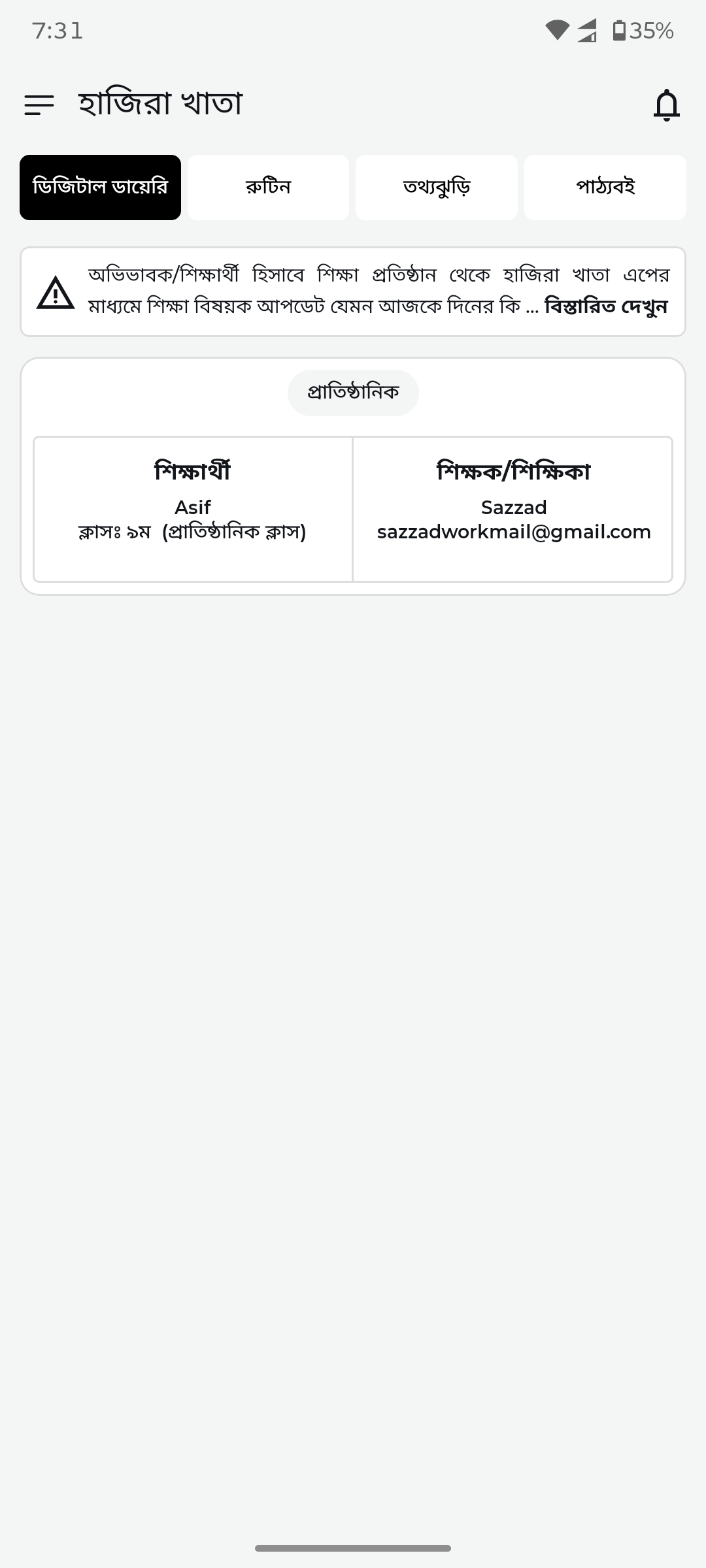
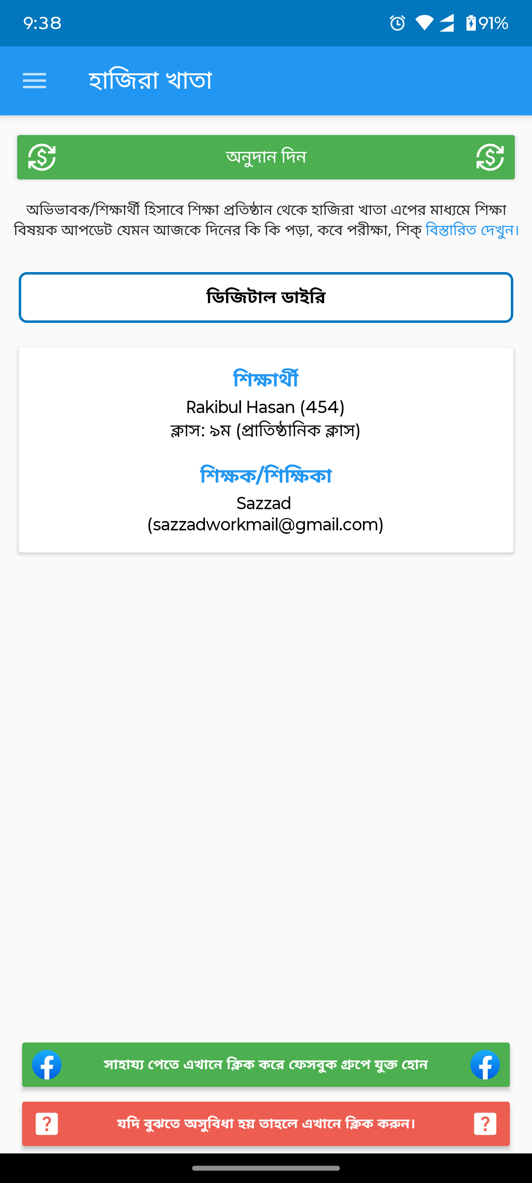
Digital diary overviewBasic list replaced by clean institutional view with student-teacher relationship cards and connection status.
After
Before
Message thread detailDense text blocks replaced by clean thread view with filter tabs, proper spacing, and readable message cards.
After
Before
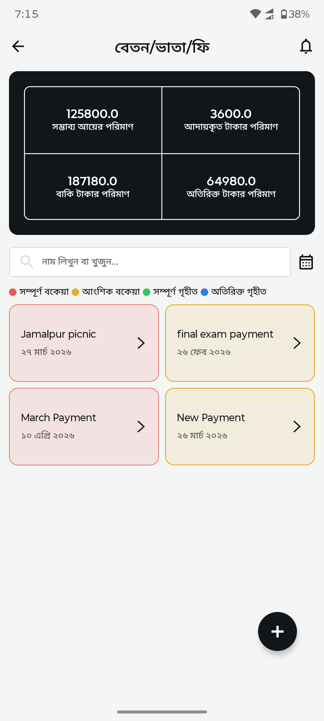
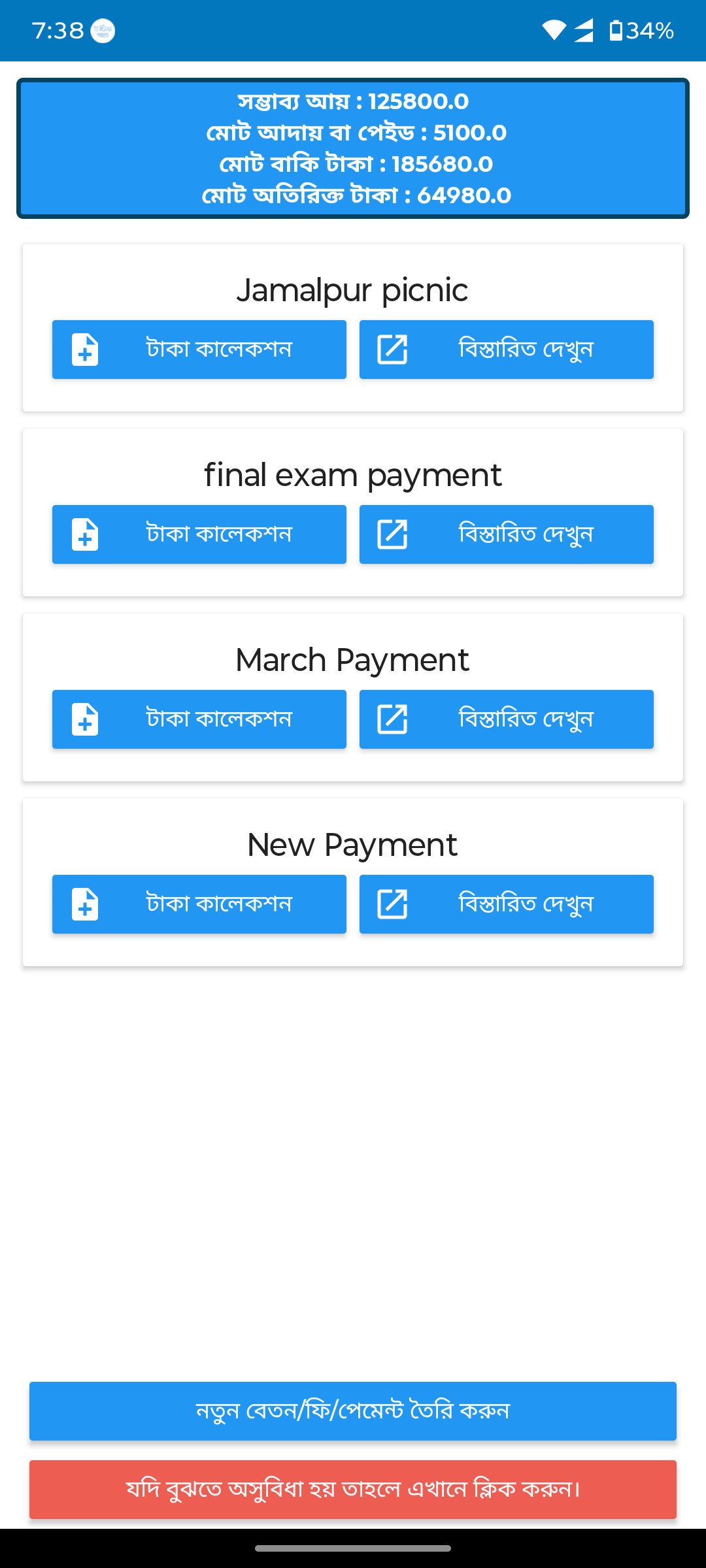
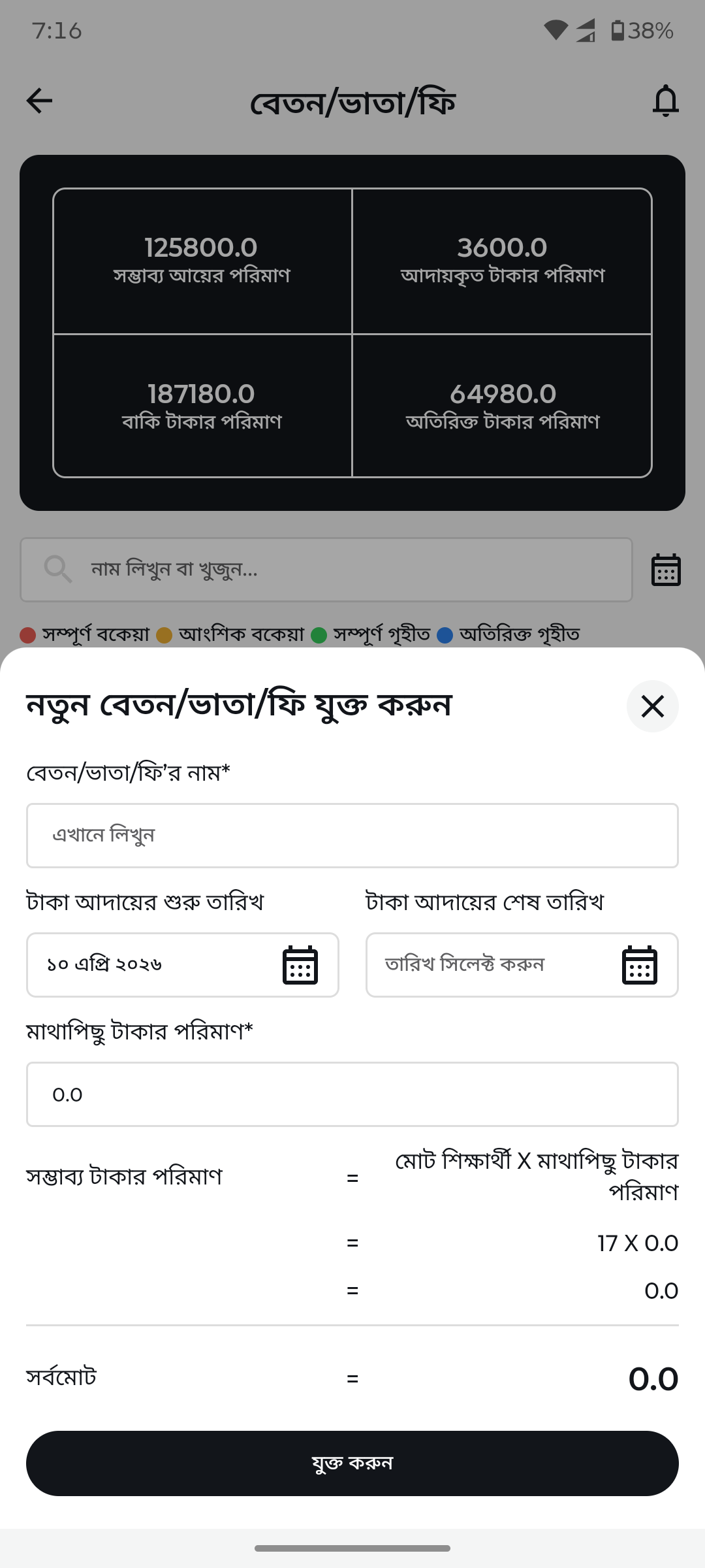
Fee dashboardNo dashboard replaced by summary cards showing total expected, collected, remaining, and extra amounts with status filters.
After
Before
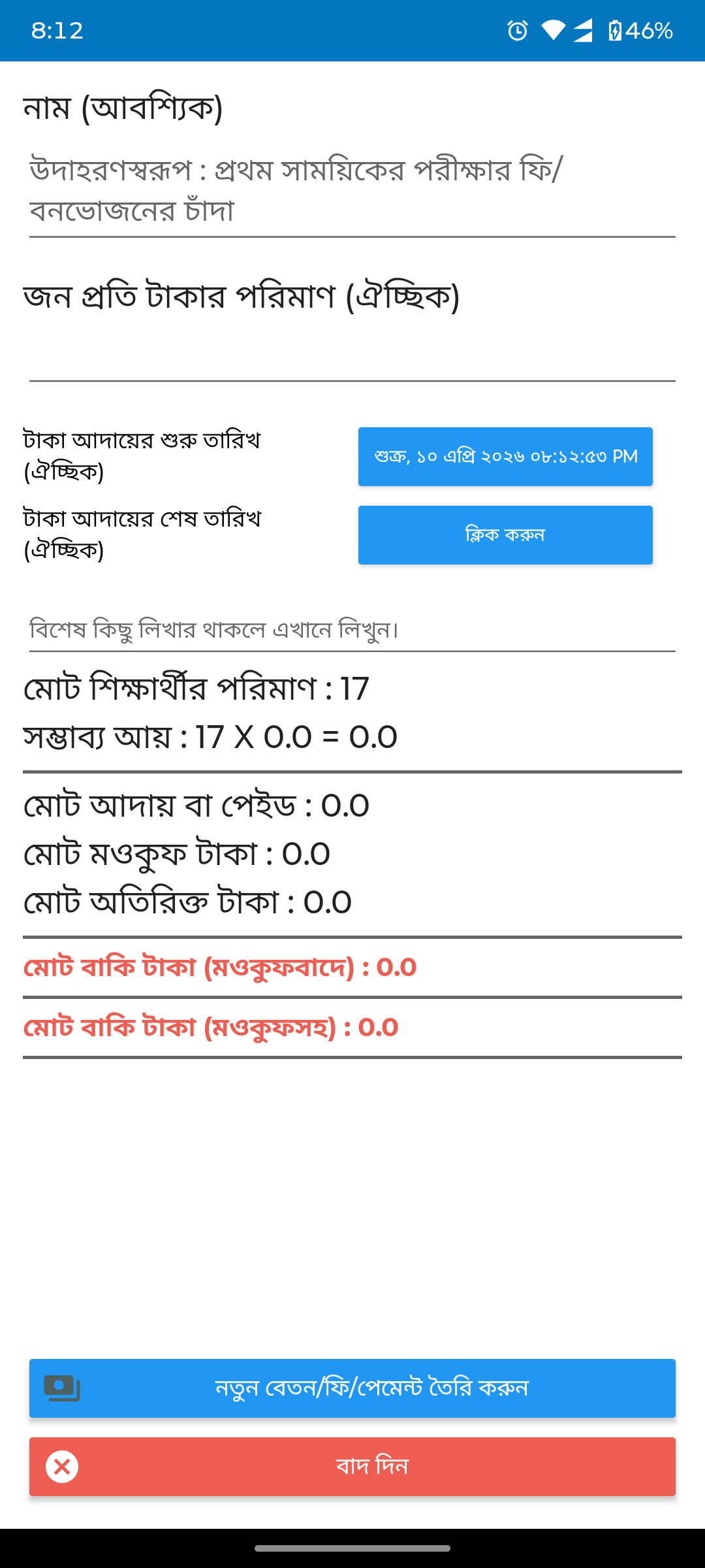
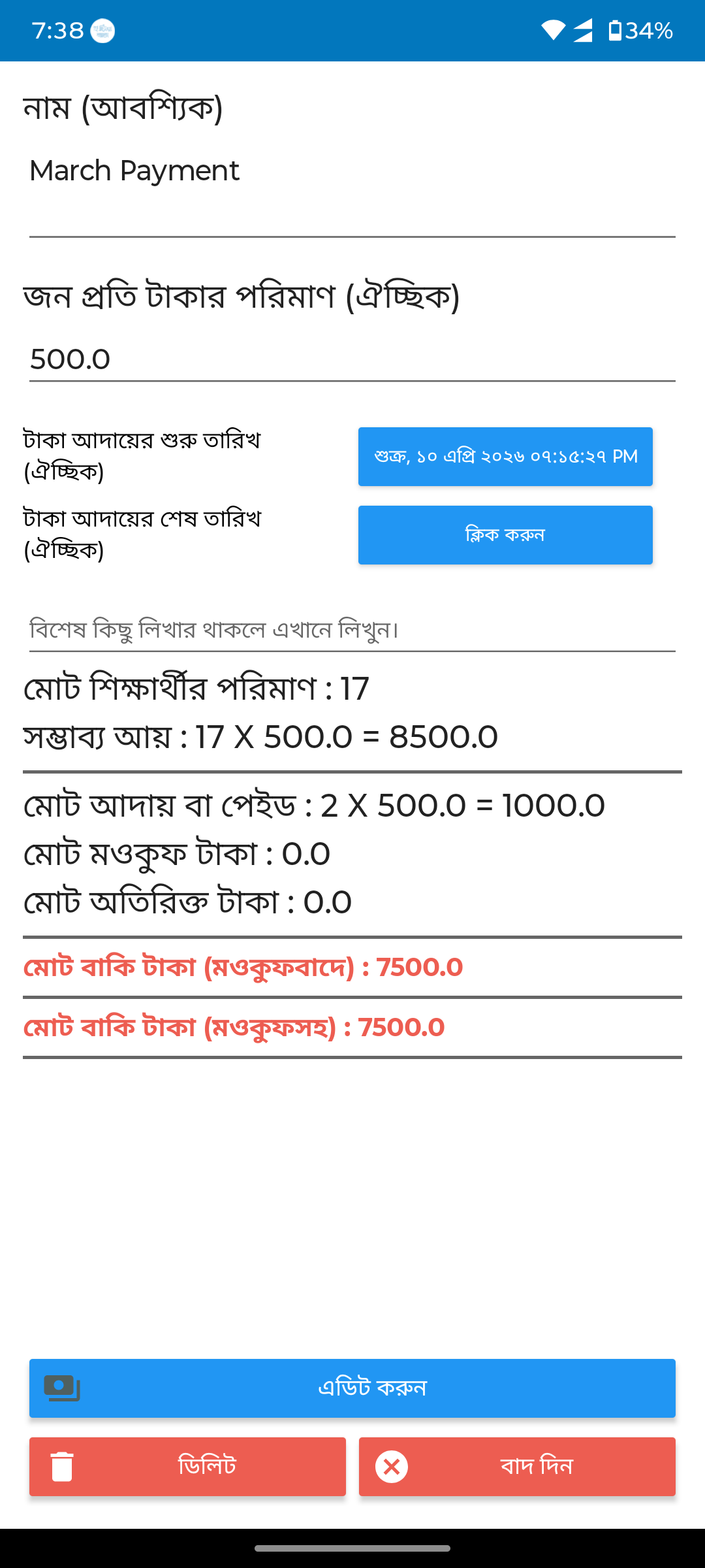
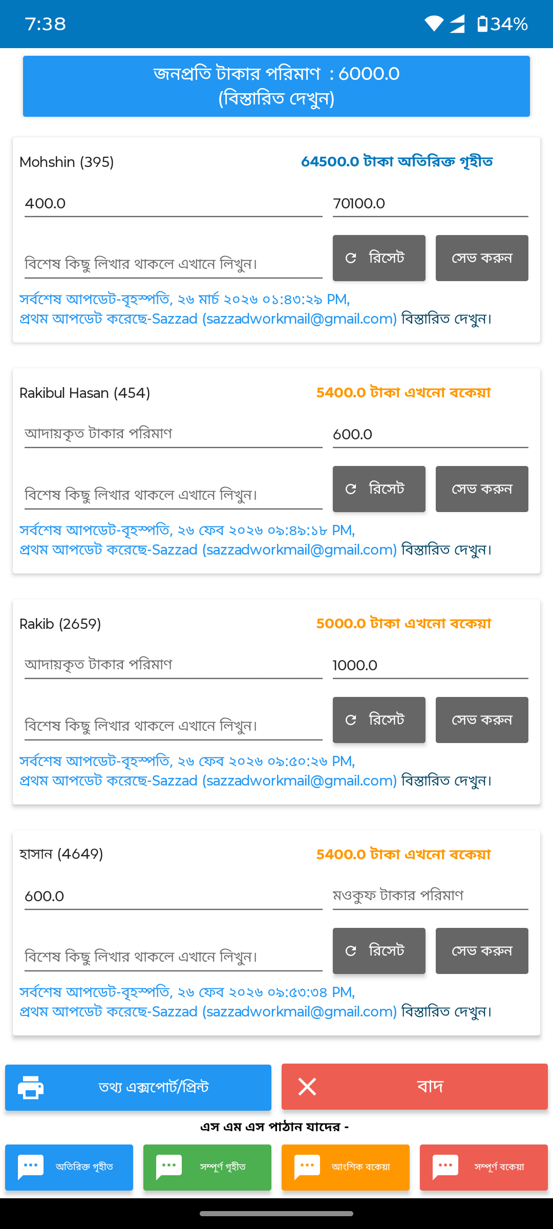
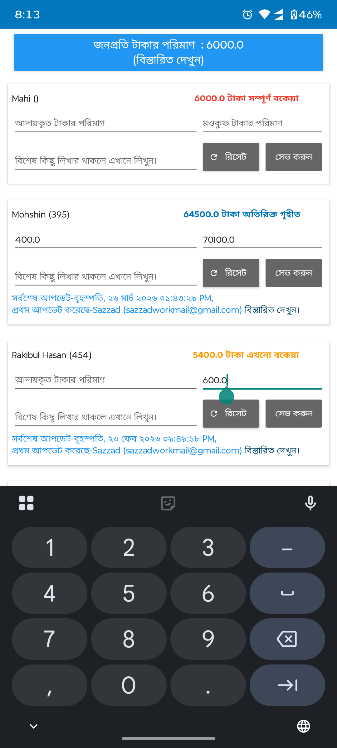
Add new fee/paymentBasic form with raw calculations replaced by structured form with date pickers, auto-calculation, and clear totals.
After
Before
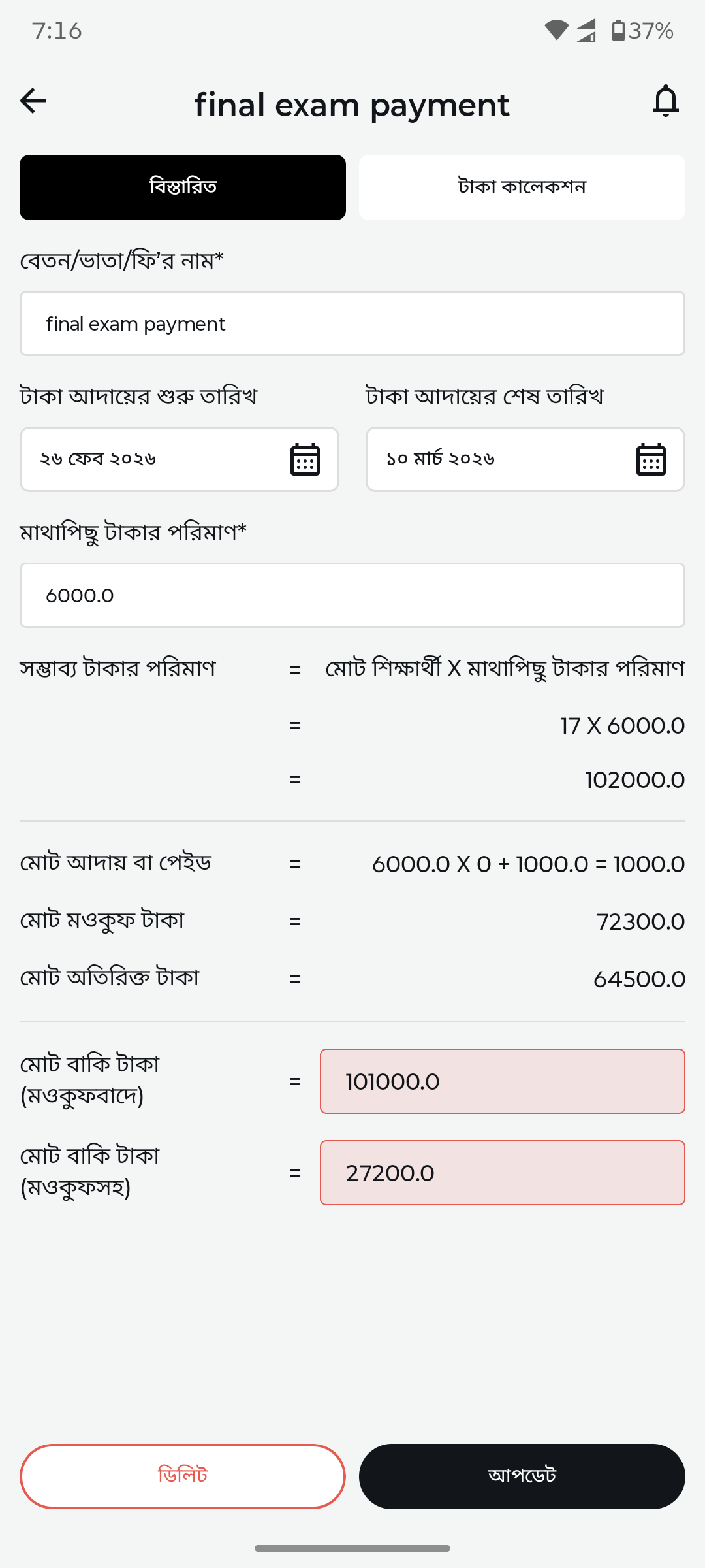
Payment detailRaw numbers replaced by organized detail view with tabs (details/collection), date range, amounts, and balance calculation.
After
Before
Payment collection listNo collection UI replaced by categorized student list with paid/partial/unpaid status colors and collection amounts.
After
Before
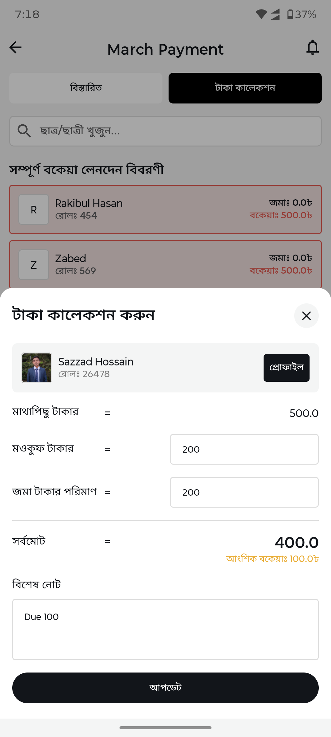
Collect payment (bottom sheet)No collection form replaced by clean bottom sheet with student photo, amount breakdown, notes, and submit button.
After
Before
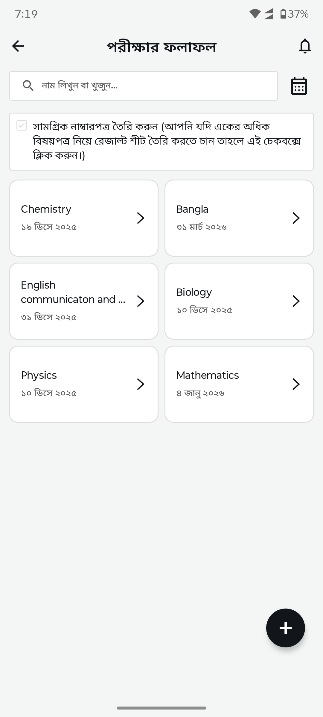
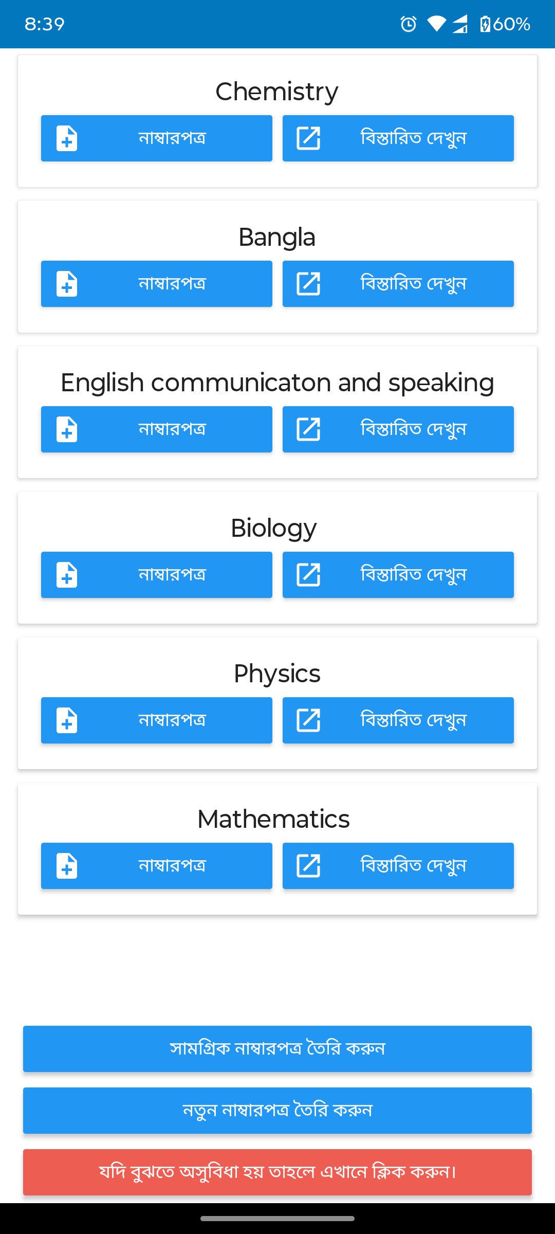
Exam results listBasic list replaced by subject cards with dates, search bar, and organized grid layout.
After
Before
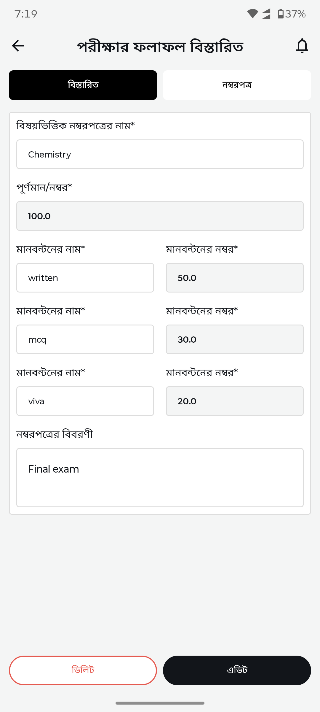
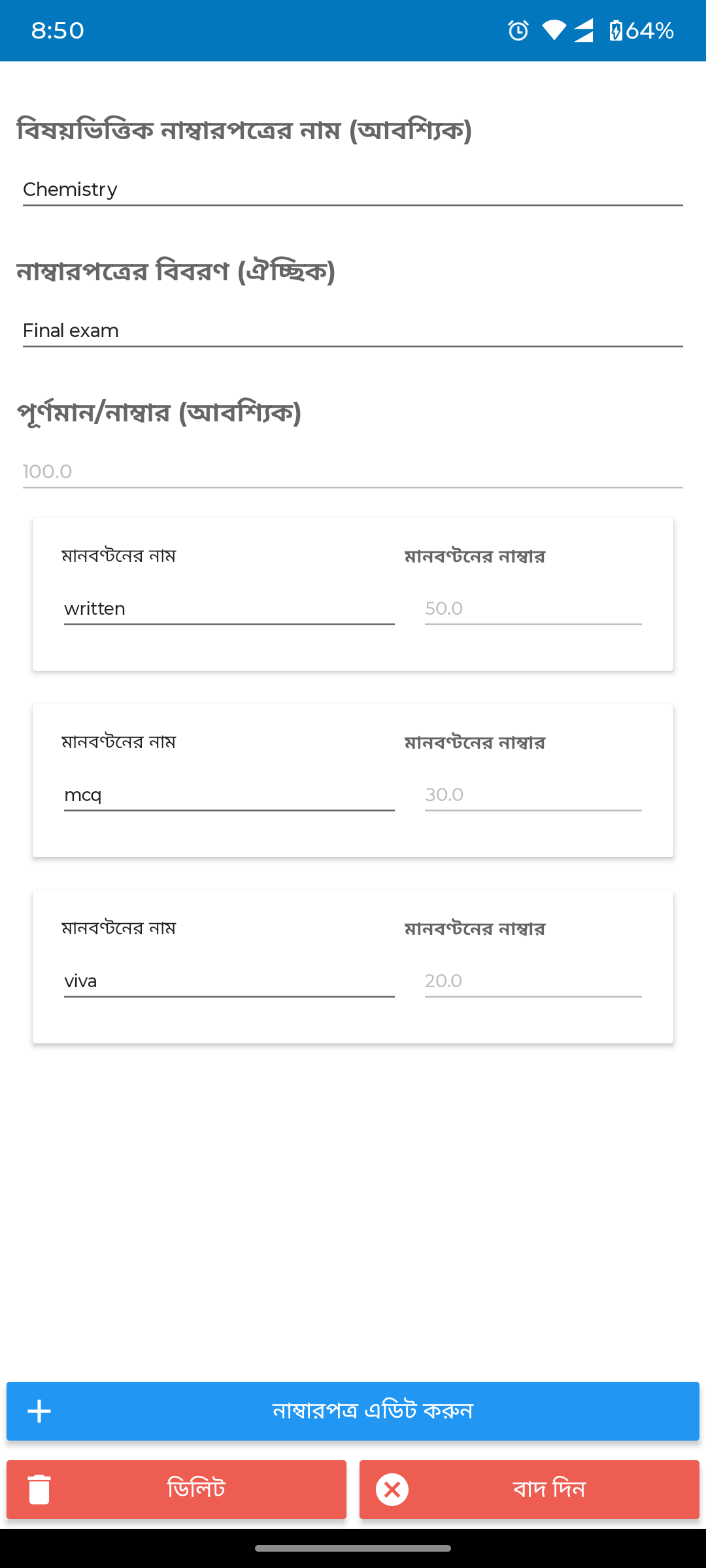
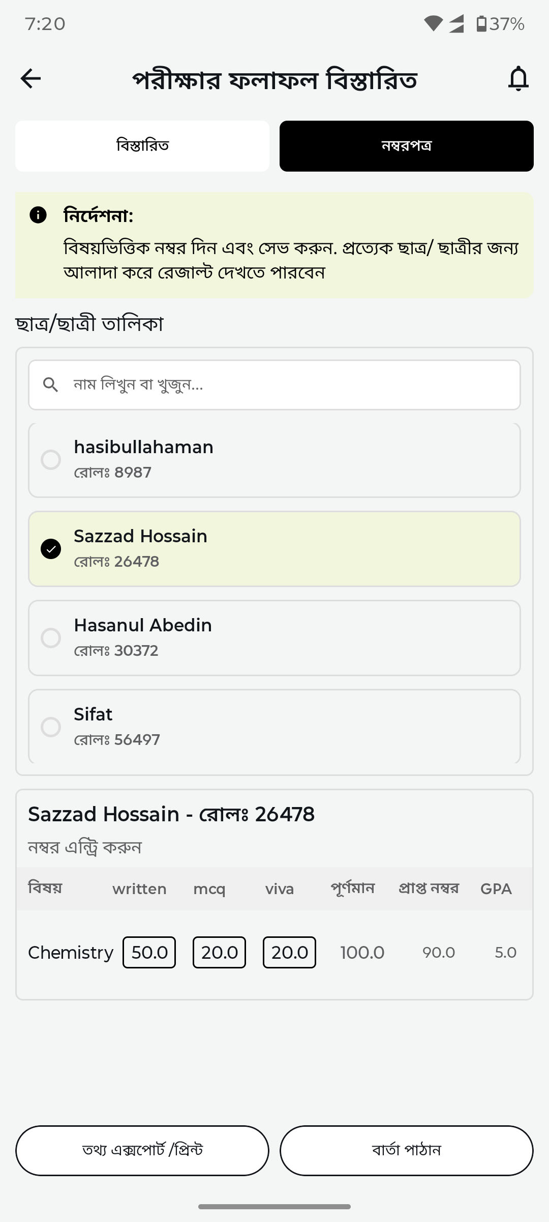
Result form builderBasic form replaced by structured mark entry with subject name, full marks, component names (written/MCQ/viva), and descriptions.
After
Before
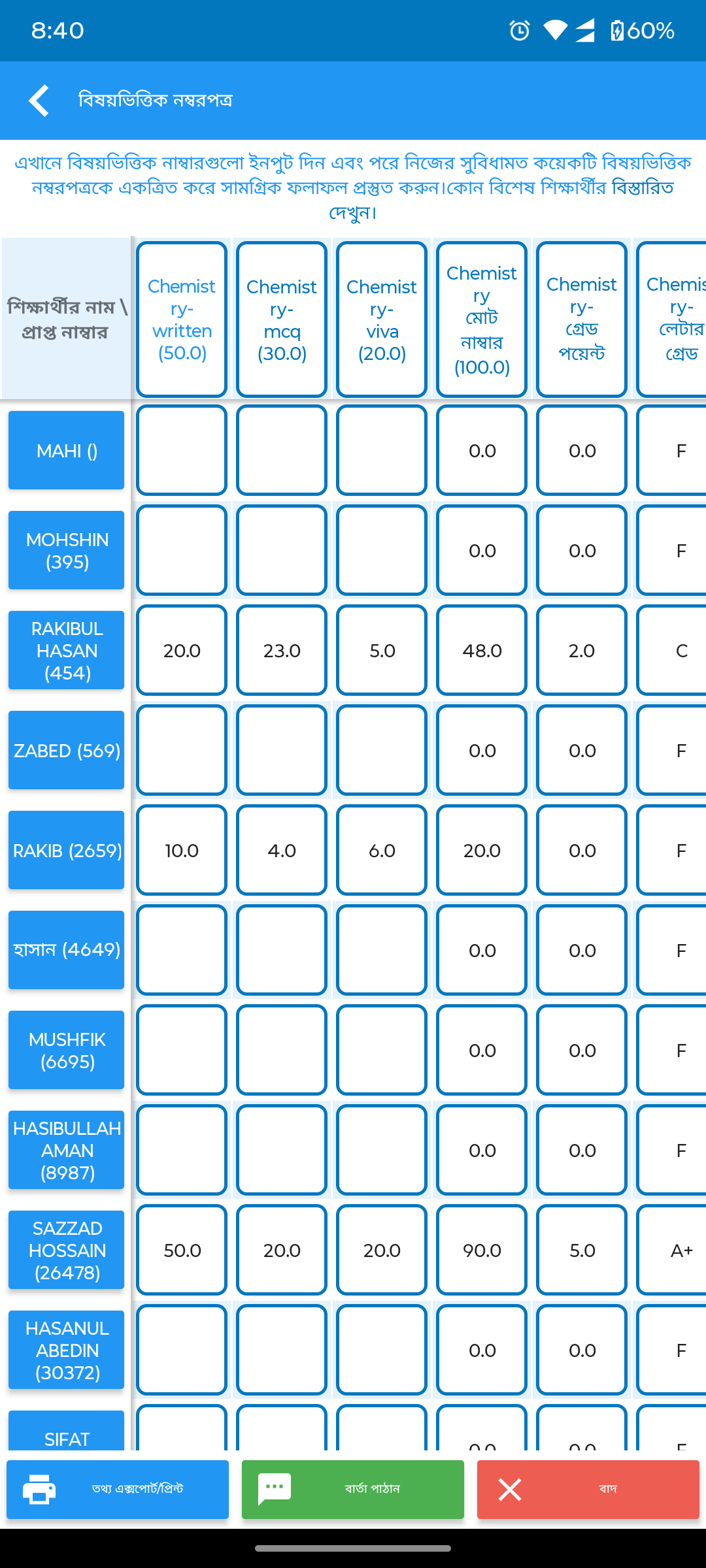
Result entry & marksNo entry UI replaced by student-wise mark entry with GPA calculation, subject columns, and tabular data display.
After
Before
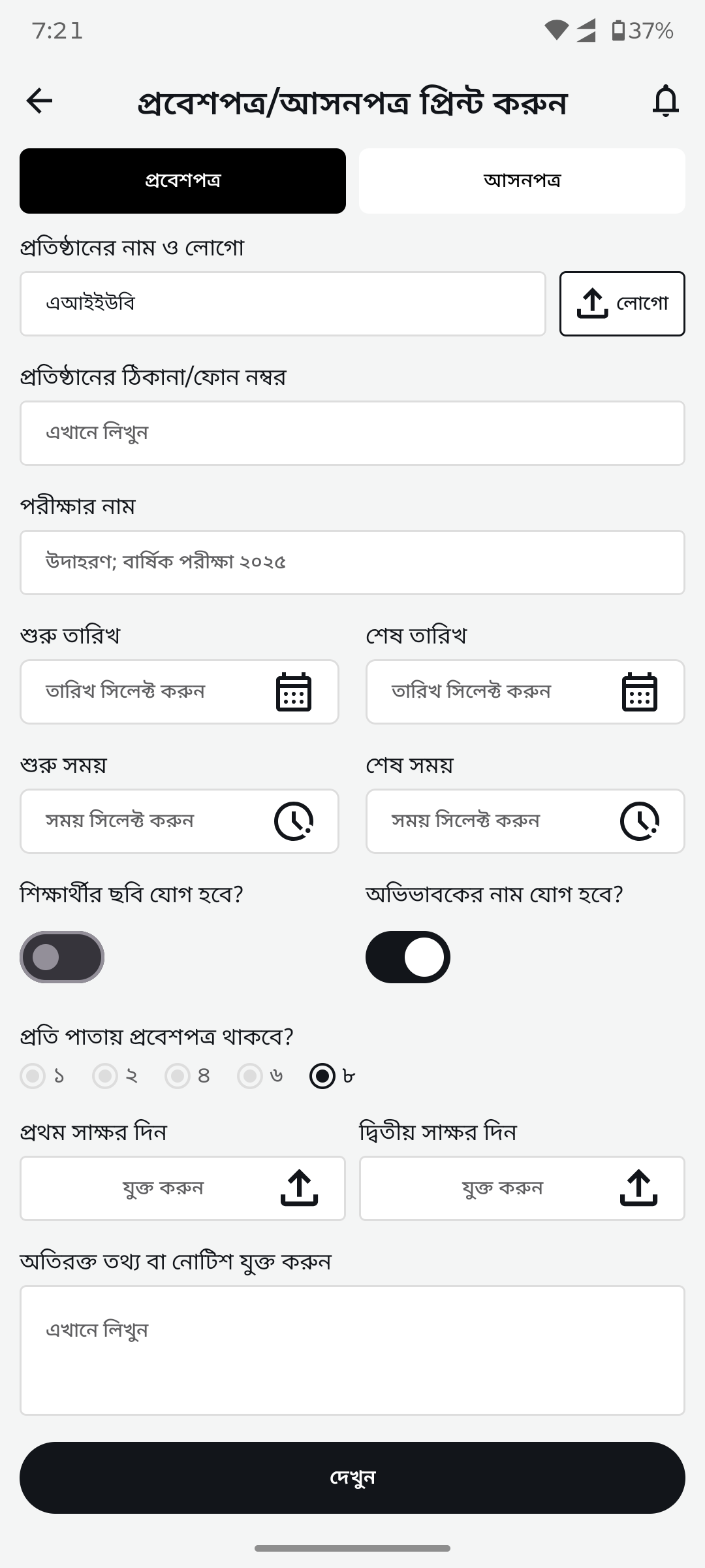
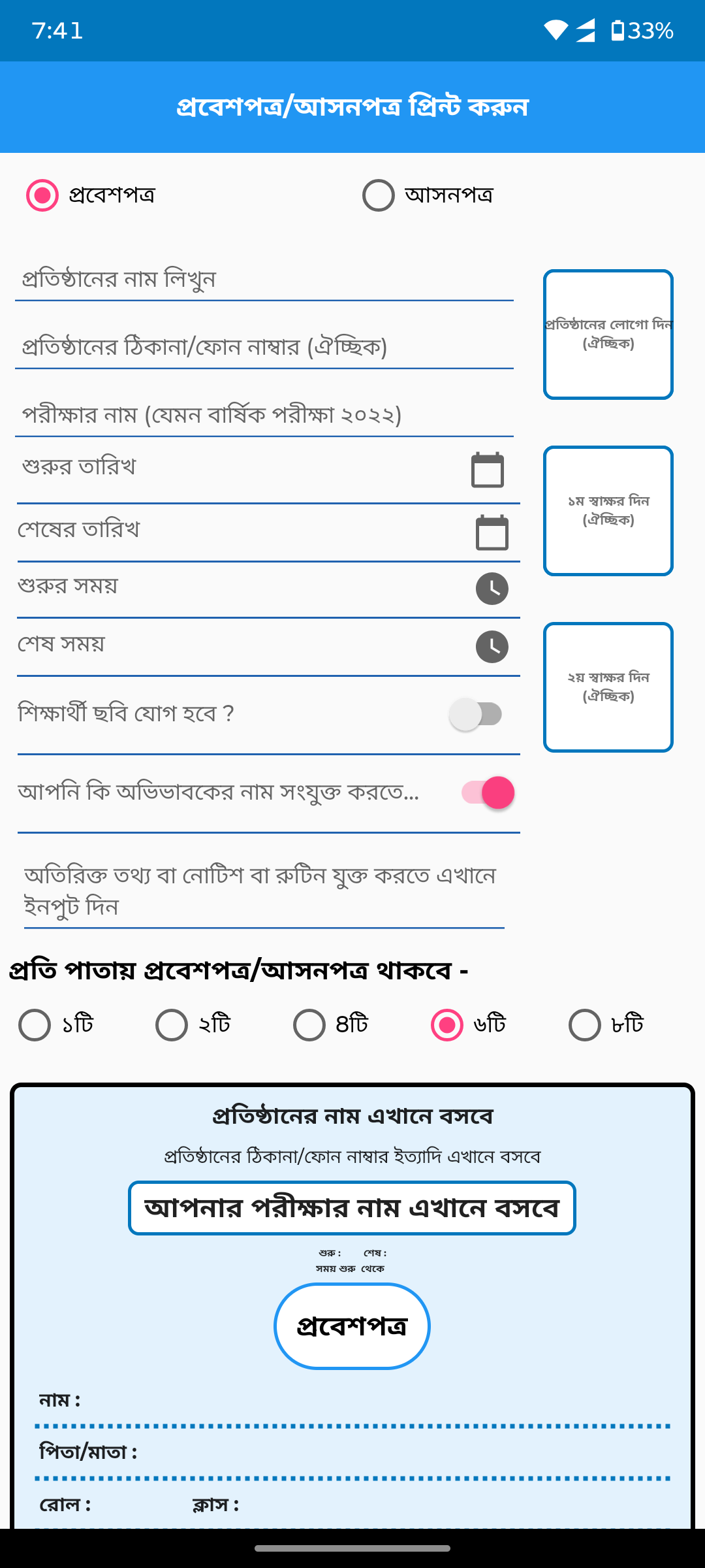
Admit card generatorBasic form with cluttered options replaced by clean form with toggles, logo upload, signature upload slots, and date/time pickers.
After
Before
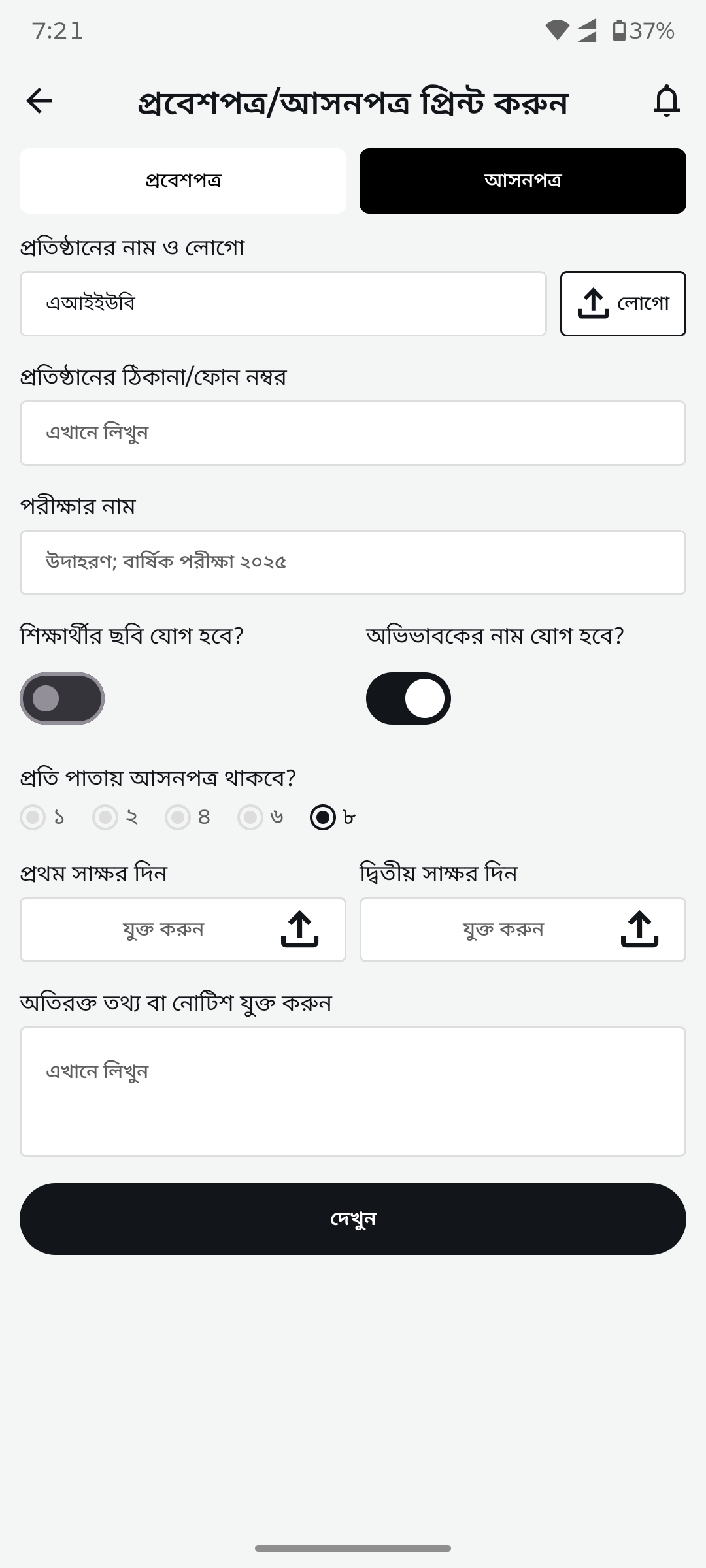
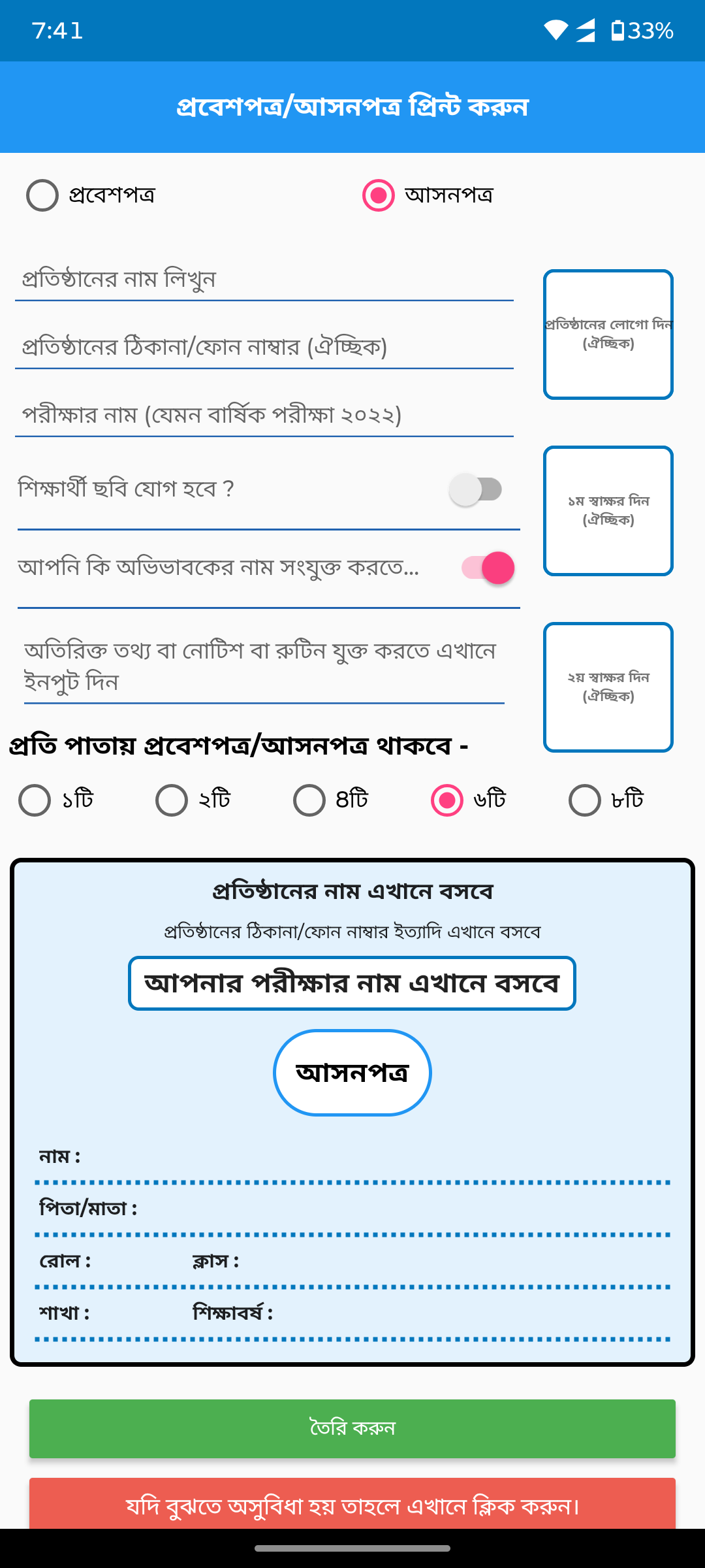
Seat plan (Asonpotro)Cramped form with pink radio buttons replaced by clean form with institution branding, toggle switches, and structured layout.
After
Before
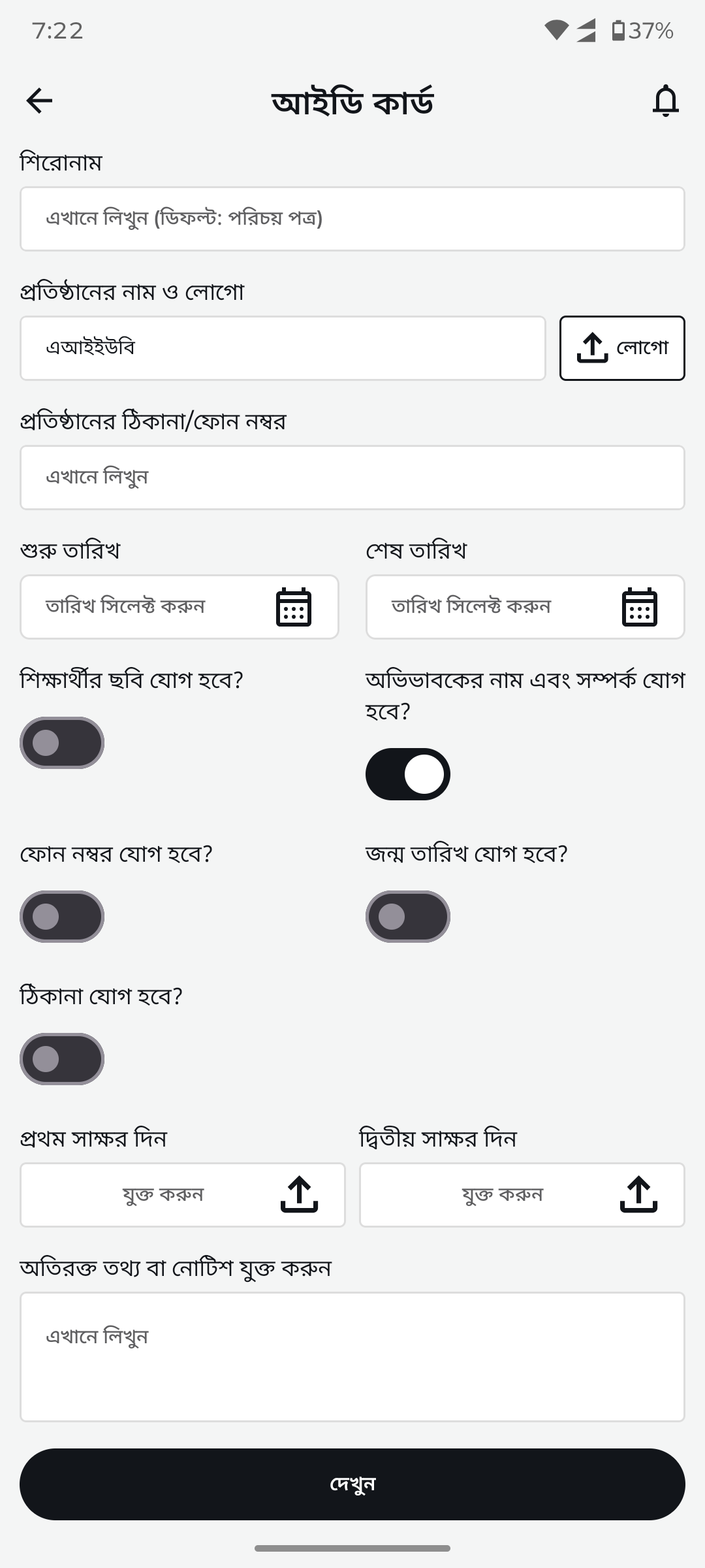
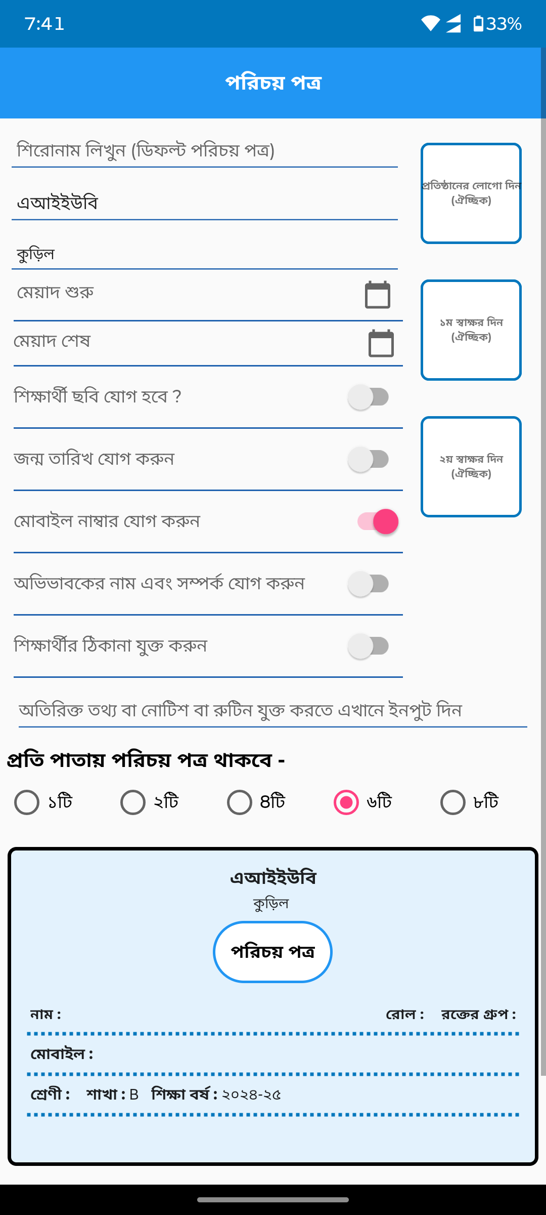
ID card generatorNo dedicated UI replaced by clean form with institution fields, photo/signature toggles, date pickers, and preview option.
After
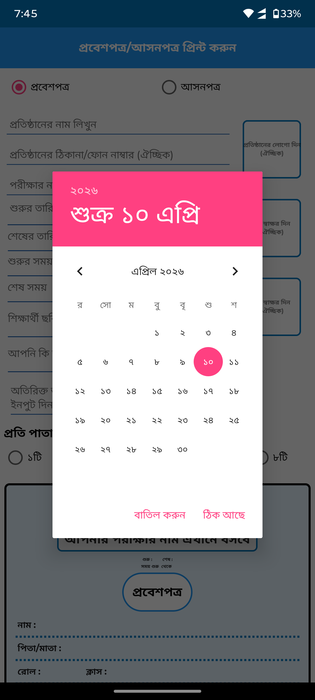
Before
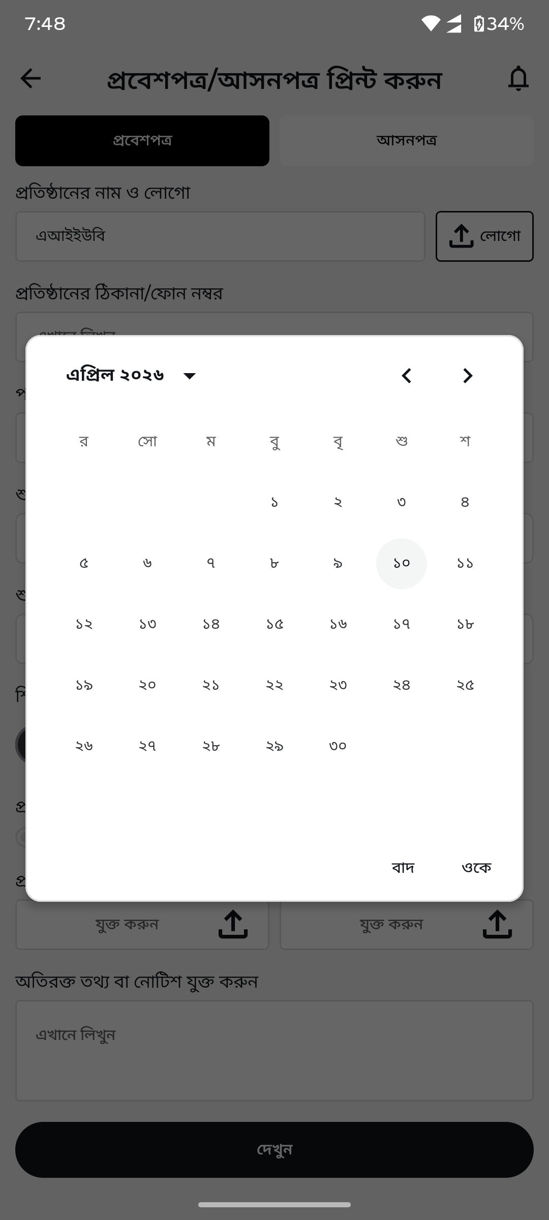
Date pickerSystem default picker replaced by custom Bangla calendar picker matching the app design system.
After
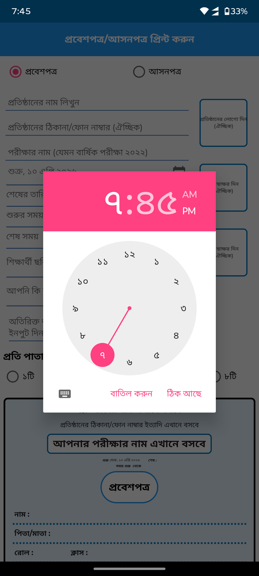
Before
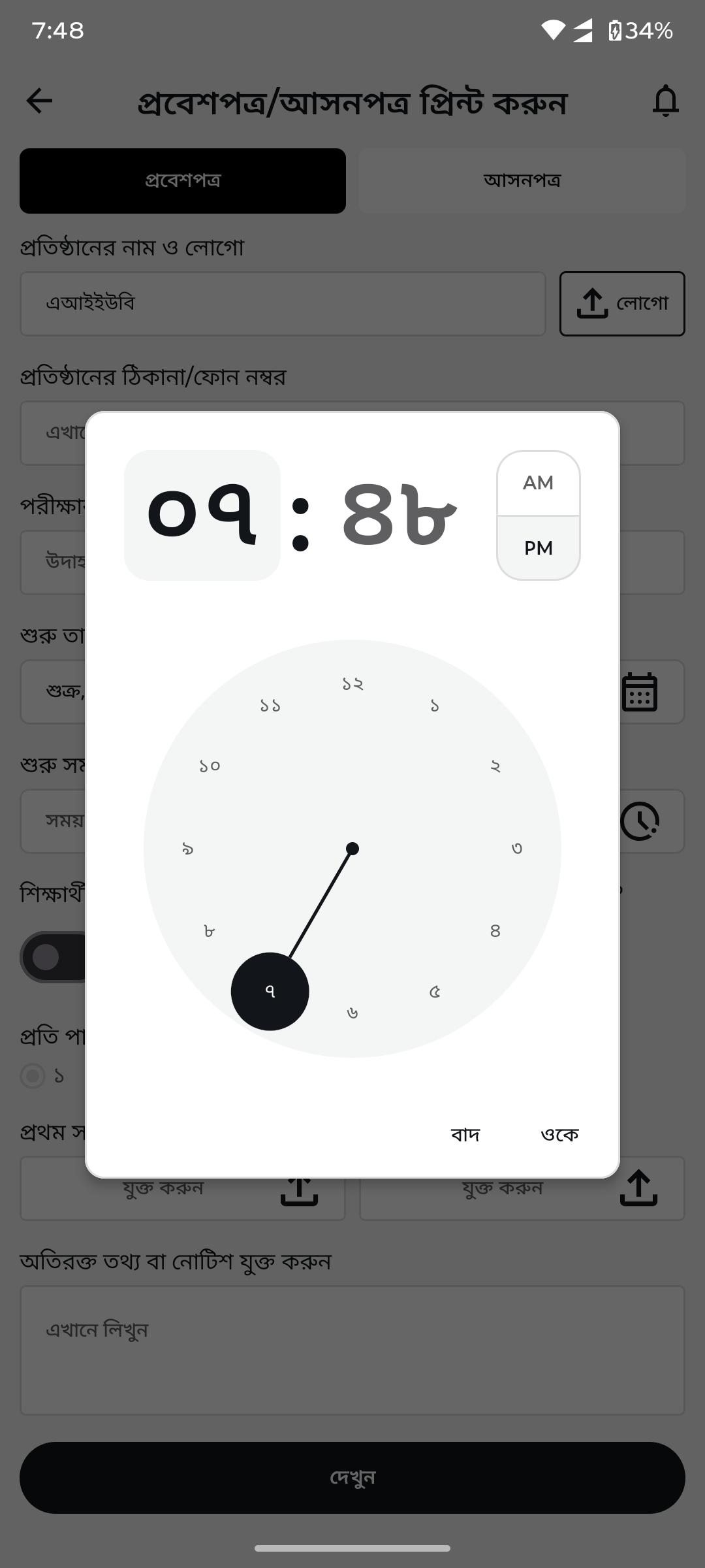
Time pickerSystem default time picker replaced by custom Bangla analog clock picker with AM/PM toggle.
After
Before
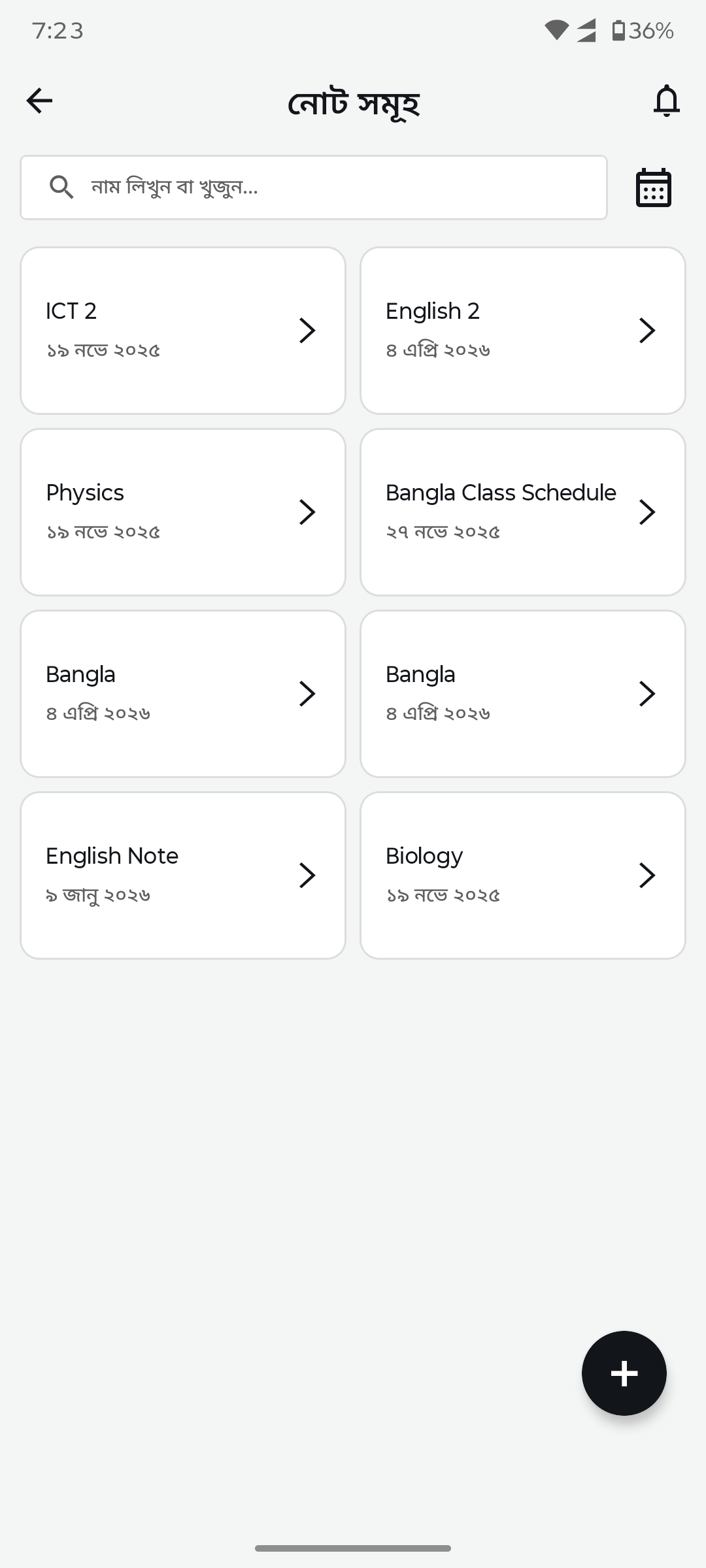
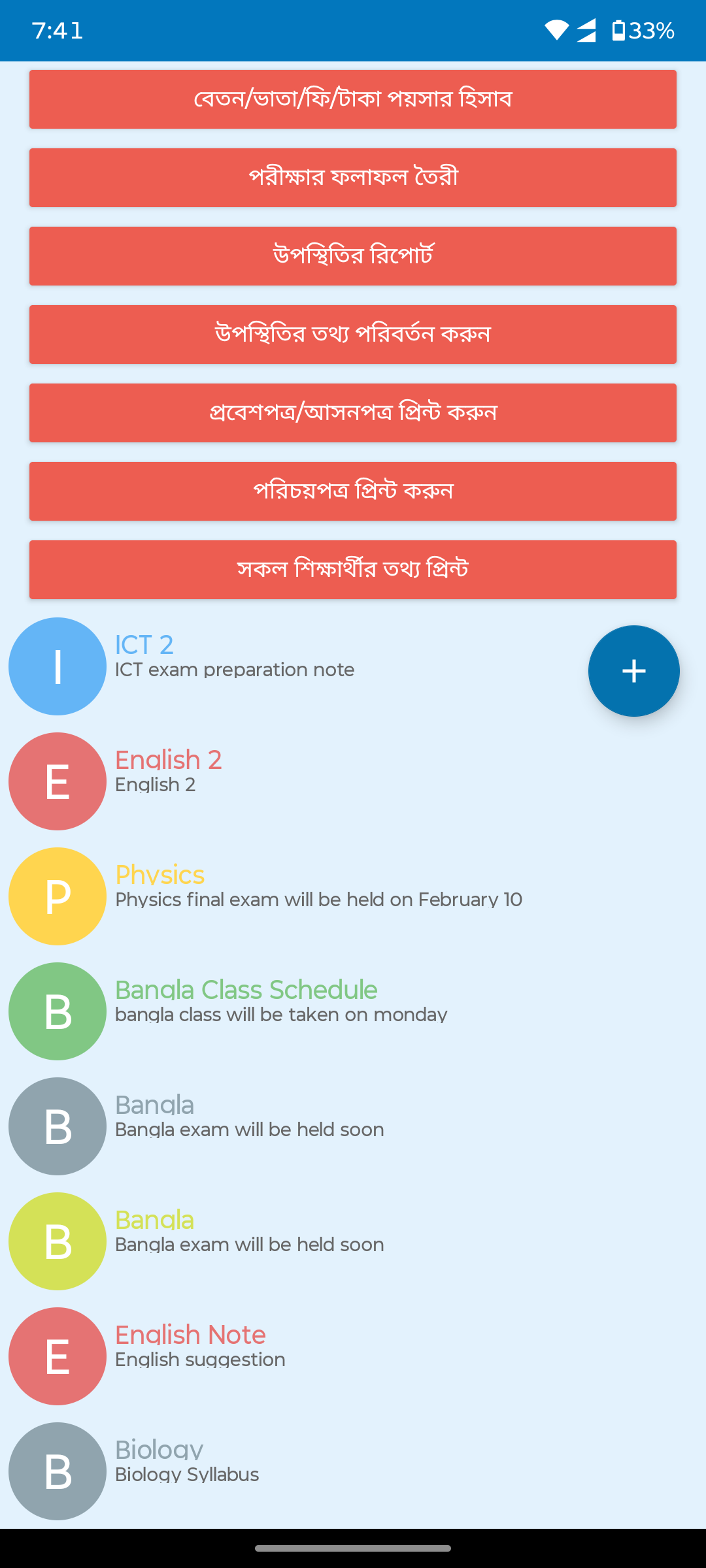
Notes listBasic list replaced by clean card grid with subject names, dates, search bar, and floating add button.
After
Before
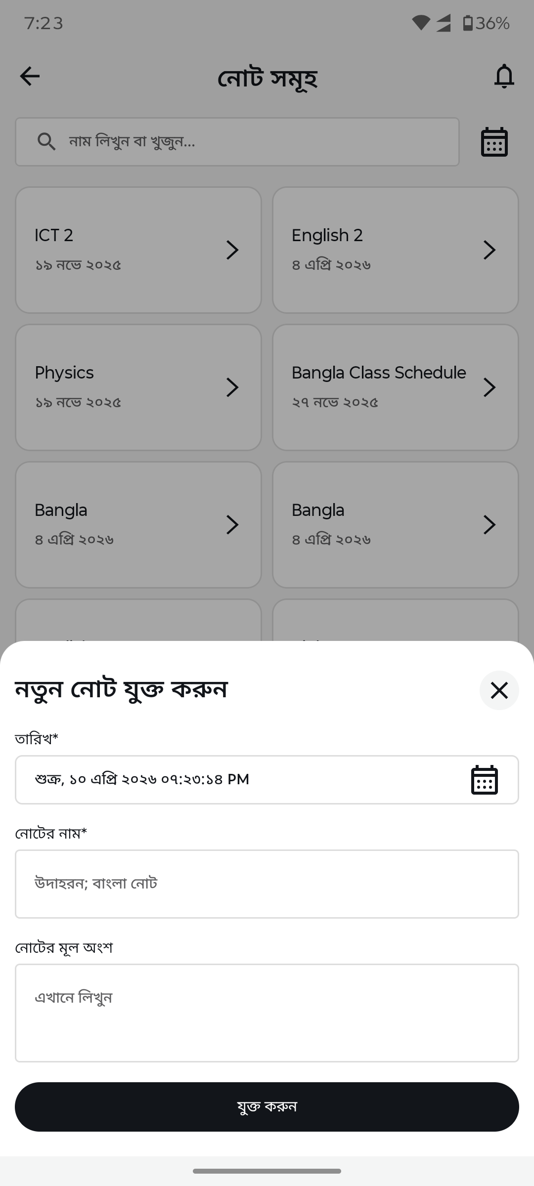
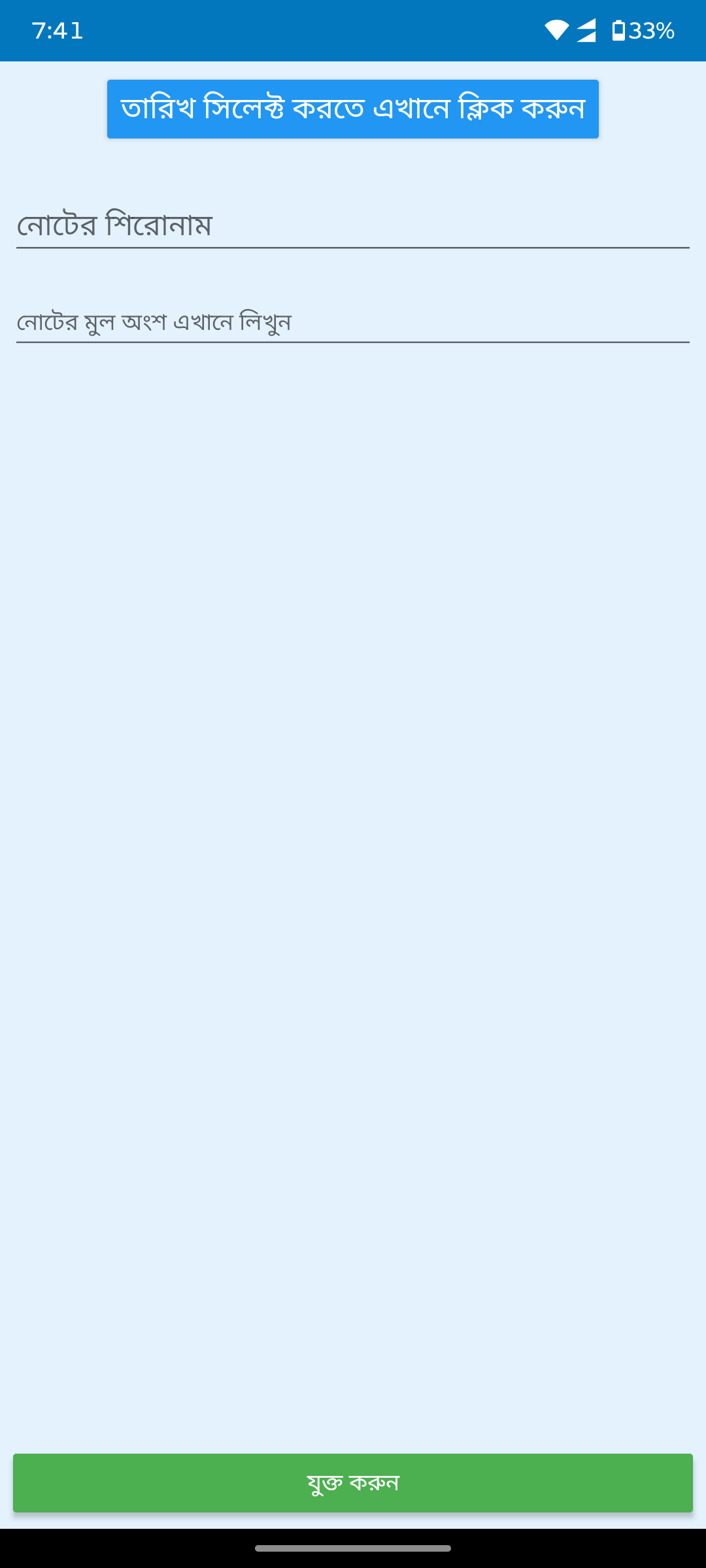
Add/edit note (bottom sheet)Basic dialog replaced by bottom sheet form with date, title, and body fields.
After
Before
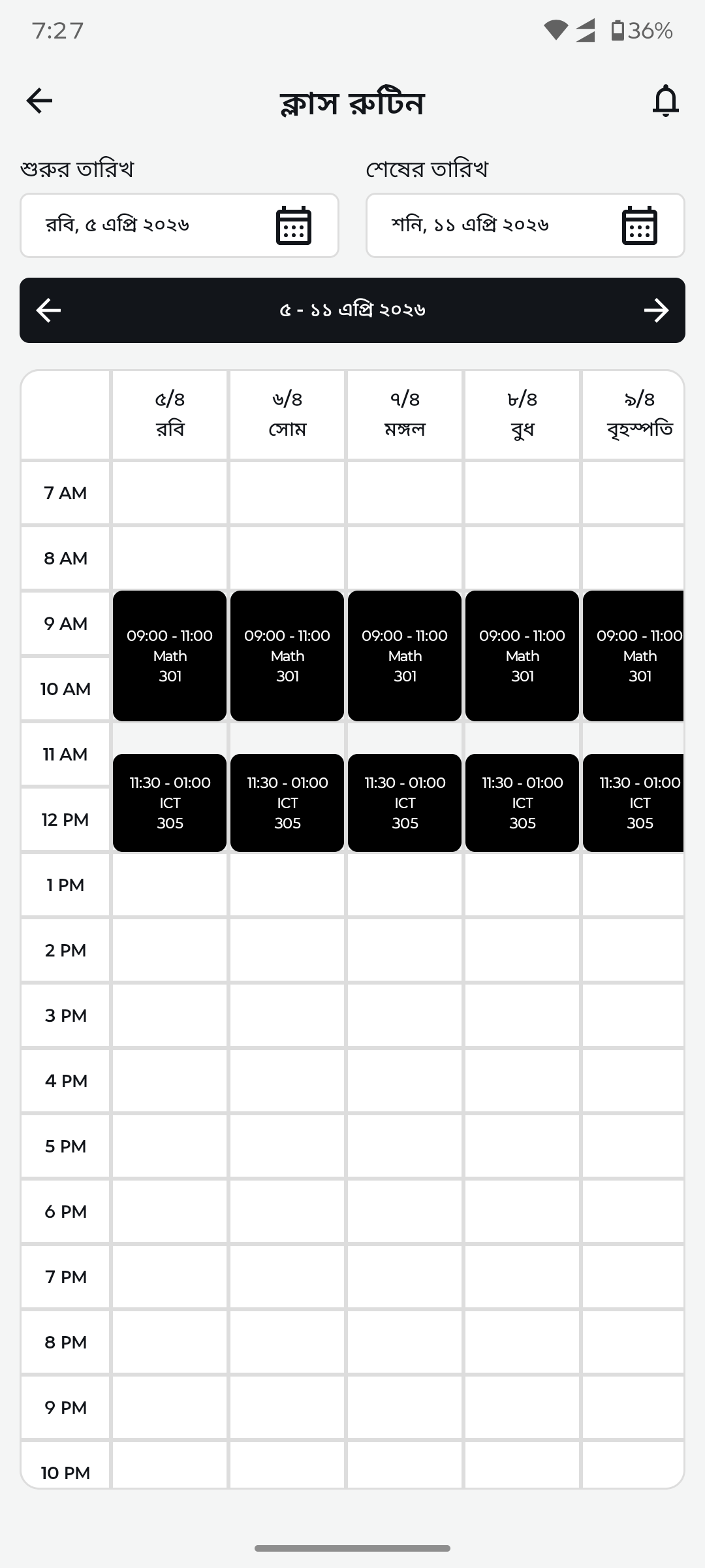
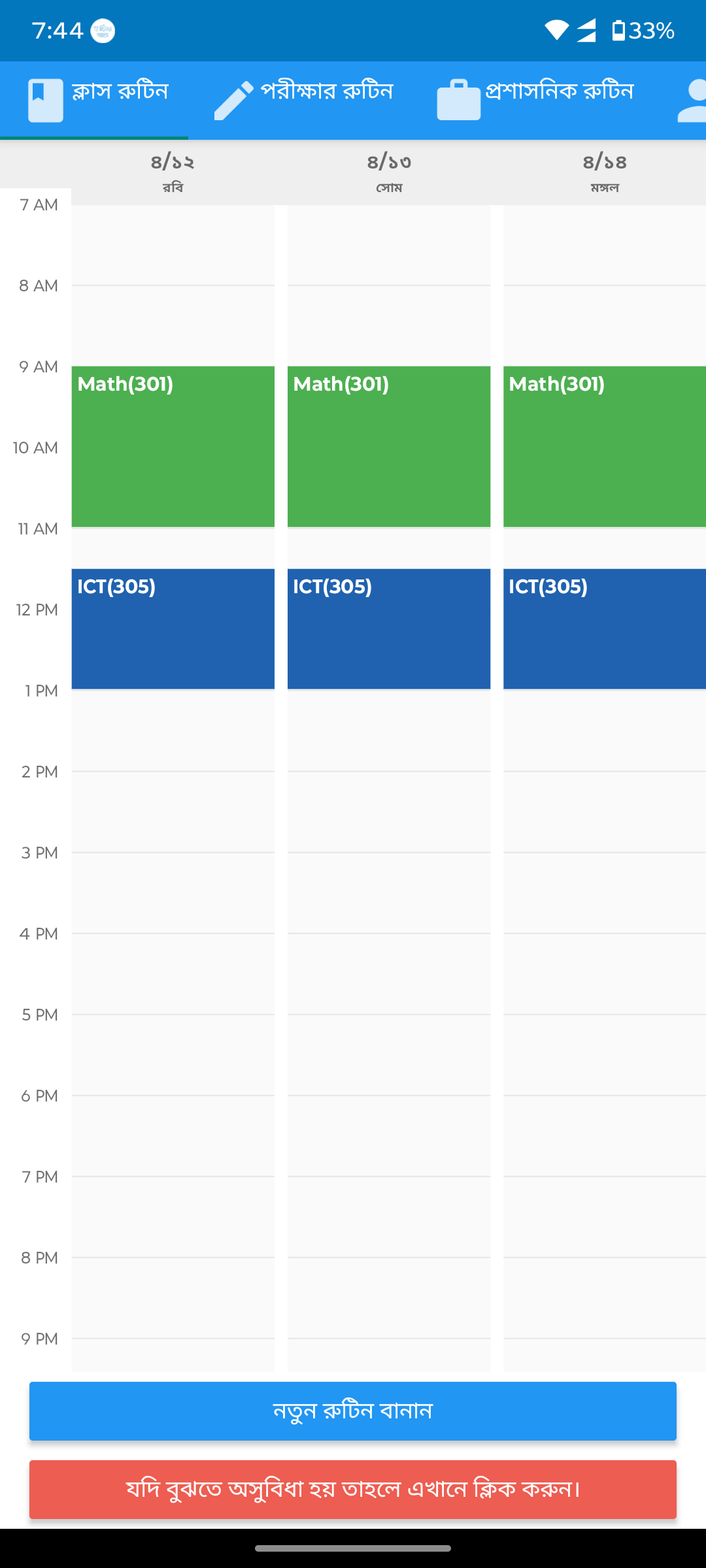
Class routine (timetable)No timetable UI replaced by weekly calendar view with time slots, subject blocks, and date range navigation.
After
Before
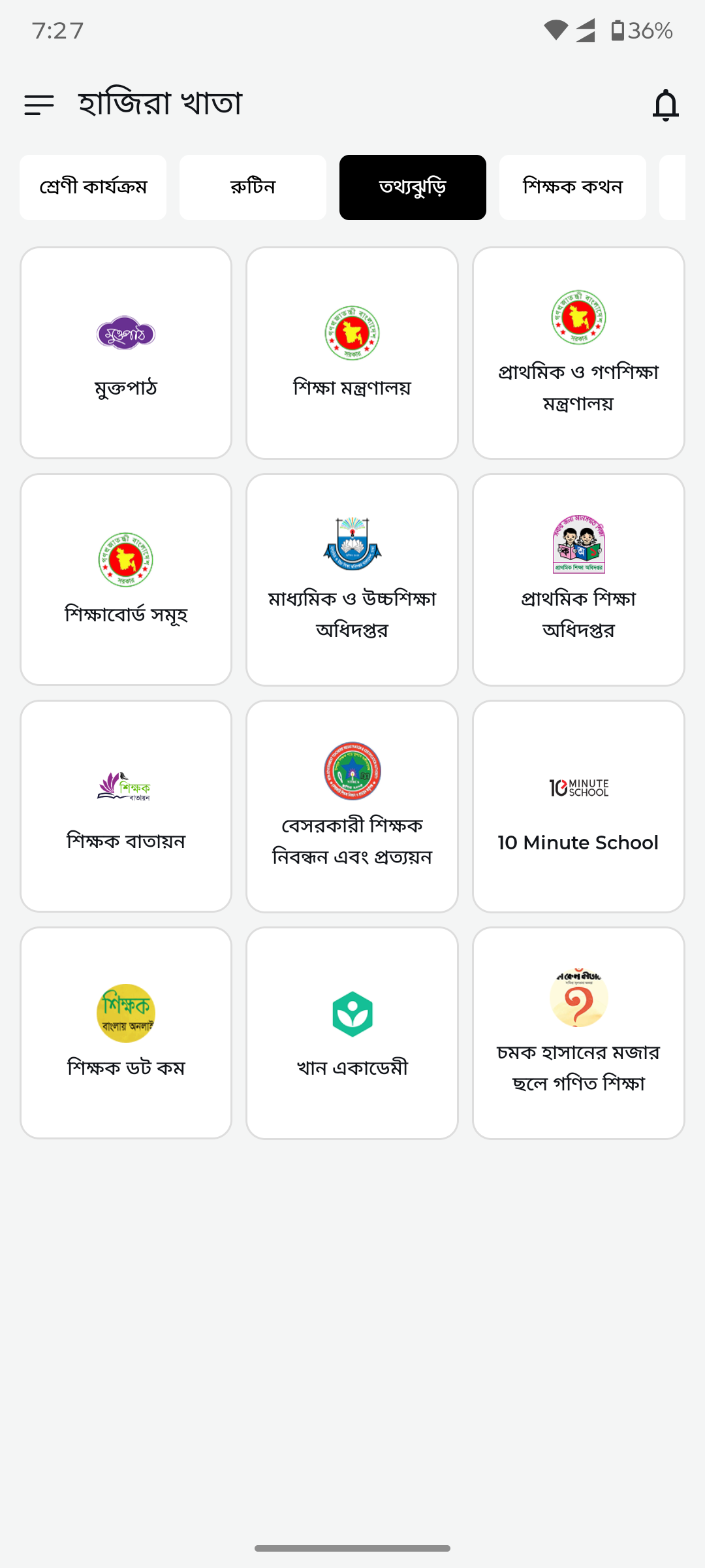
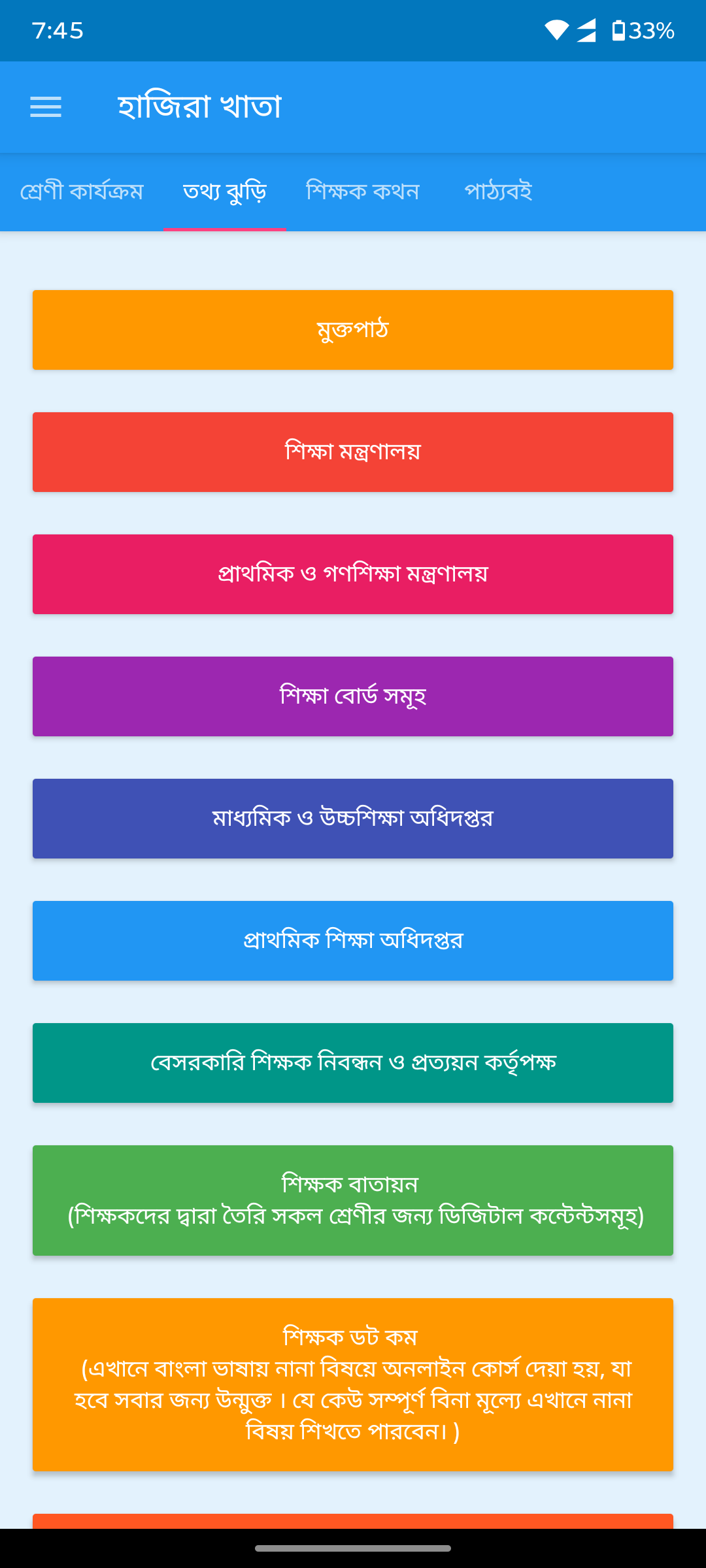
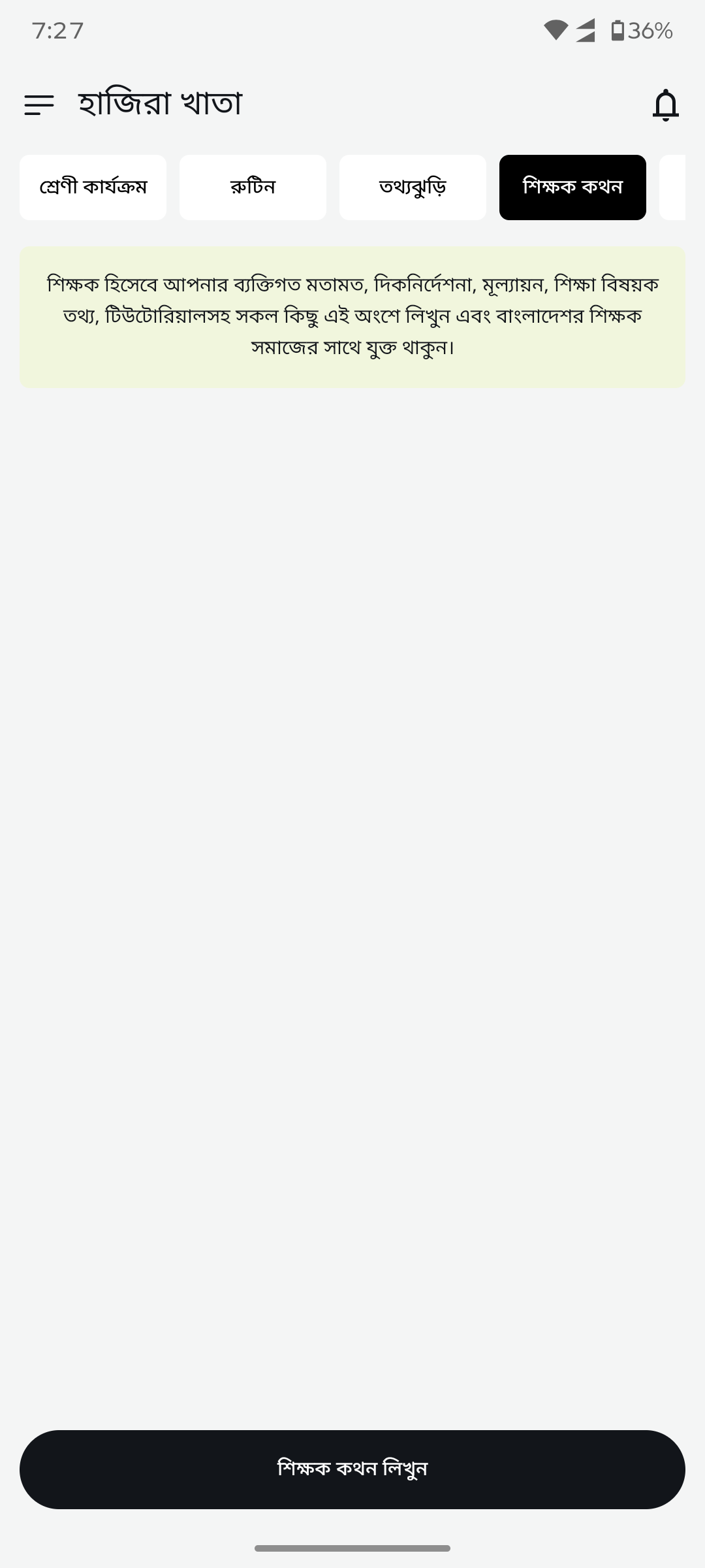
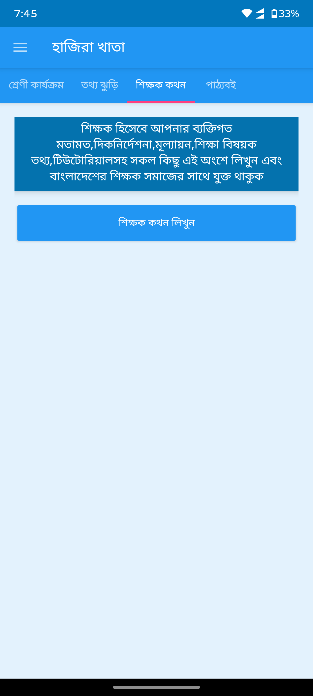
Teacher resource hubRainbow text blocks replaced by organized icon grid with government portals, Khan Academy, 10 Minute School, and community links.
After
Before
Teacher community blogNo blog UI replaced by clean tab with community description and write-post CTA button.
After
Before
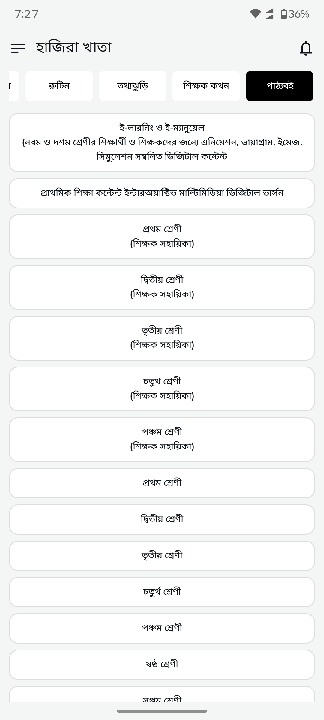
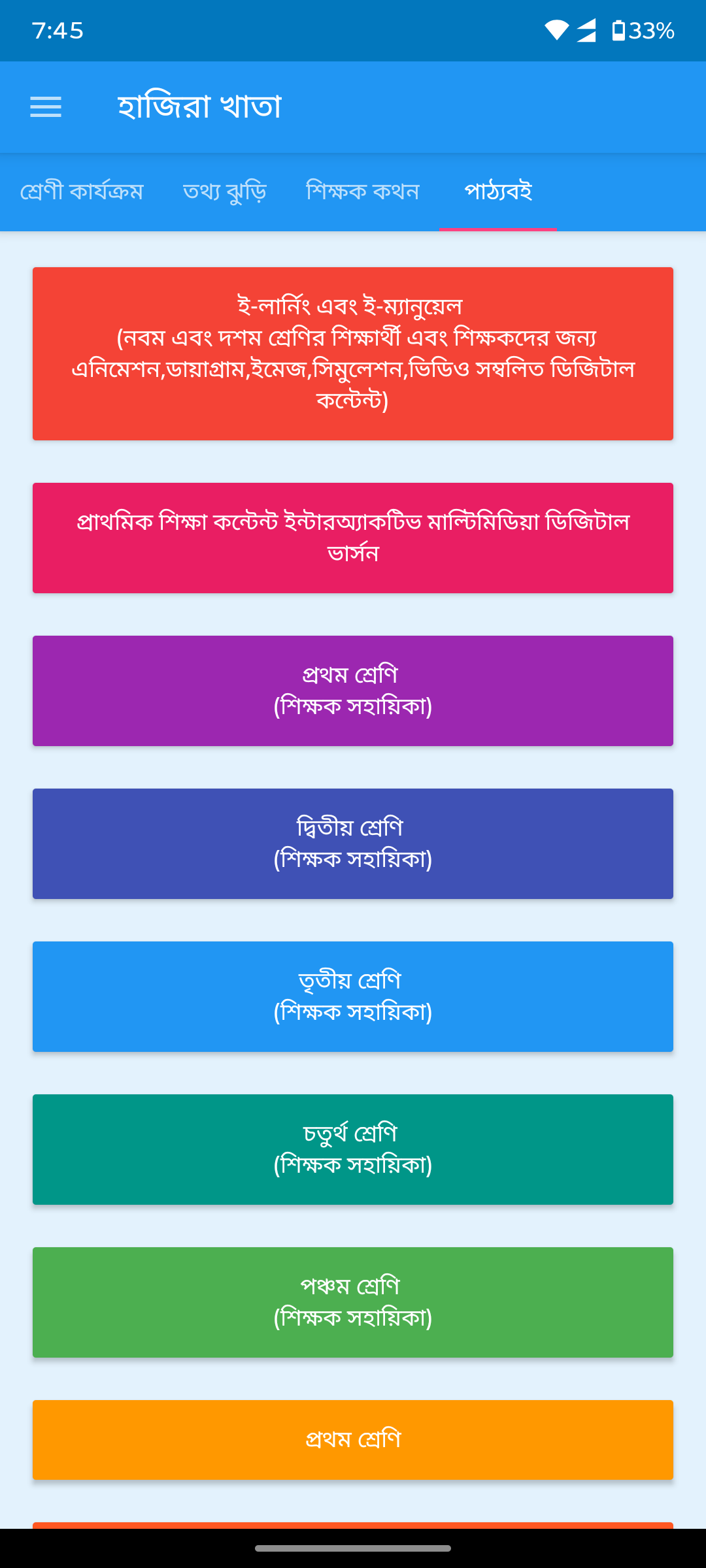
Textbook resourcesNo resource UI replaced by organized class-wise list (Class 1-10) with NCTB digital textbook links.
After
Before
Results
38+ screens redesigned from legacy XML to modern Jetpack Compose
Clean, professional UI replacing cluttered blue-heavy design
Material 3 design system with proper spacing and visual hierarchy
Improved touch targets and accessibility for teacher-age users (25-55)
Zero functionality regression — all features preserved during migration
Modernized form inputs, toggles, and data display components
Consistent design language across onboarding, dashboard, lists, and forms
Need an app redesign like this?
We modernize Android apps from legacy XML to Jetpack Compose, redesign outdated UI, and migrate to modern architecture — without breaking existing features. All work through Upwork with payment protection.
The full UI/UX overhaul of 38+ screens was completed over several months of iterative development, with each screen carefully redesigned and tested to ensure zero functionality regressions for the 100K+ active user base.
Can you redesign my Android app from XML to Jetpack Compose?
Yes. We specialize in migrating legacy Android XML layouts to Jetpack Compose with Material 3. We redesign your UI while preserving all existing functionality. Hire us through Upwork with payment protection.
What is the cost of an Android app redesign?
App redesign costs vary by scope. A full UI overhaul like Hazira Khata (38+ screens) is a significant project. Monthly development packages start from $1,500. Contact us for a scoping call and estimate — all work through Upwork with escrow protection.
Will the redesign break existing features?
No. Our approach prioritizes zero-regression migration. We test every screen against the original functionality before deployment. The Hazira Khata redesign preserved all features while modernizing 38+ screens.
Do you redesign iOS apps too?
Yes. We build cross-platform apps with Flutter (iOS + Android from one codebase) and also work with native Swift/SwiftUI for iOS and Kotlin/Jetpack Compose for Android. Contact us to discuss your project.
How do you handle a redesign for an app with 100K+ users?
Carefully. We use phased rollouts — redesigning screen by screen, testing with beta users, and monitoring crash reports (Firebase Crashlytics) before each production release. This approach minimizes risk for large user bases.
Ready to modernize your app?
Hire us through Upwork — your payment is protected by escrow. You pay only when you approve the work.